Whether you're a designer at an agency or a Verizon employee working in Powerpoint, Brand Central is where you go for any brand guidance or assets you need – well, that's the goal at least.
The challenge
As a resource, Brand Central currently lacks the trust of its users. You rarely find what you're looking for because:
- Content is often dated or limited
- Search doesn't return expected results
- Confusing taxonomy and content organization make it difficult to navigate and find content
Additionally, while brand assets can be searched for and downloaded individually from the site, the brand guidelines are collected in a single PDF. The PDF contains more information than most users are usually interested in. It also results in multiple, dated versions of the guidelines circulating within teams and organizations.
“As a resource, Brand Central currently lacks the trust of its users.”
For the first phase, my team at SapientNitro was tasked with digitizing the Brand Guidelines, while identifying gaps and potential improvements to existing content.
Establishing Brand Central as a trusted resource, and properly educating those creating Verizon-branded work, is just one small step in an ongoing effort to unify the Verizon brand.
What I did
As 1 of 2 experience designers on the team, I joined following discovery to help solidify our design approach and execute on it. I worked closely with designers and developers on page design, page interactions, and detailing both front-end specifications and CMS requirements.
With some initial discovery already done, much of the user needs, business goals, and current state issues had already been identified. These findings drove my work when auditing content, determining page structure, and iterating on the initial wireframes.
I had a lot of help
-

-

- Experience designers
-
- Visual designers
-
- Front-end developers
What we delivered
- Content audit
- Annotated wireframes
- Comps
- Prototype
My toolbox
- Illustrator
- InDesign
- Excel
Understanding content
Our primary goal was to ensure brand guidelines content is valuable and easily found on Brand Central.
Content is most valuable when it's the latest and greatest available. Users would only trust the tool if Brand Central's content is consistently so. To facilitate this goal, we would define a process for content governance and create authoring tools on the CMS side to support that process.
To ensure content is easily found, we focused on two things: language and content organization.
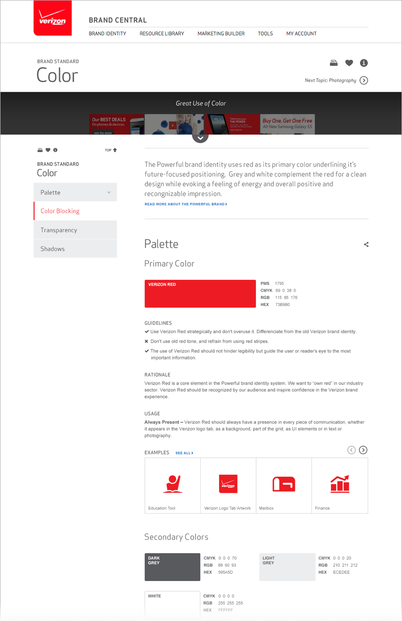
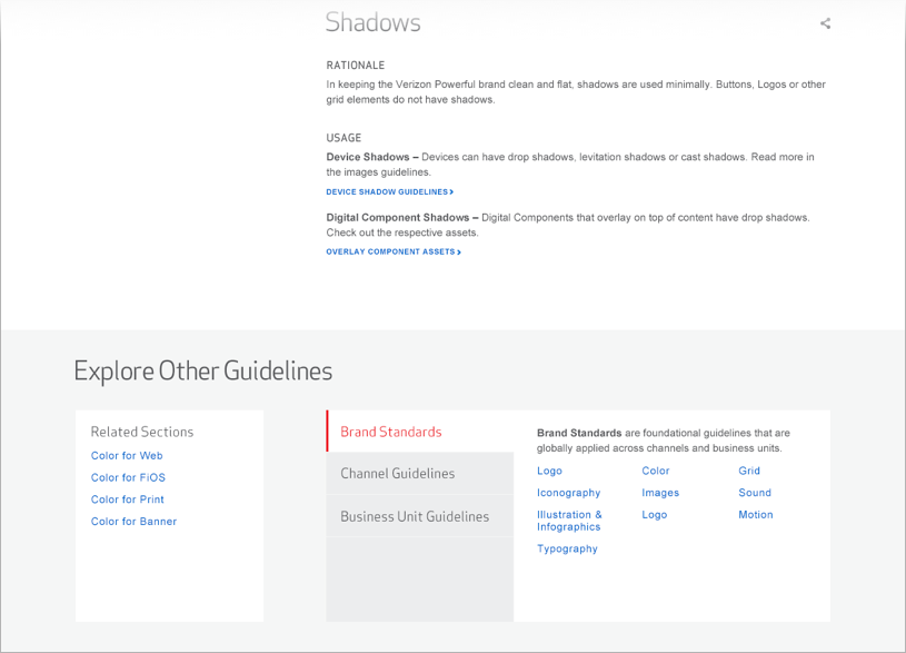
Firstly, the Brand Guidelines serve both digital and traditional mediums, so it was important that the language used on the site is easily understood by both. We organized guidelines content into 3 buckets: Brand Standards, Channel Guidelines, and Business Unit Guidelines, in respective order of the broadest-serving guidelines to the most specific. For example, Brand Standards describes typography as it broadly applies to both digital and traditional mediums, while Business Unit Guidelines describes typography in the context of a specific Verizon sub-brand or campaign.
3 guideline buckets
- Brand Standards
- Logo
- Color
- Typography
- Iconography
- Photography
- Motion
- etc.
- Channel Guidelines
- Web
- Tablet
- Mobile
- TV
- In-store
- etc.
- Business Unit Guidelines
- Consumer and Mass Business
- Wireless
- Verizon Enterprise Services
- Internal Communication
- Corporate
- etc.
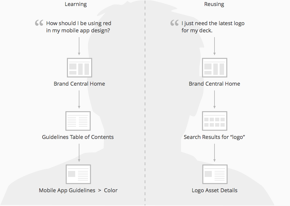
Secondly, given the task-oriented nature of users coming to Brand Central, it needs to feel less like a website and more like a tool. Upon joining the project, it was already discovered that users arrive at the site with one of two mindsets: finding and reusing assets, or learning how to use them, usually when their work is flagged as off-brand. Our recommended site structure revolved around learning about the brand and reusing assets, to reflect this mental model.
Two mindsets
“...it needs to feel less like a website and more like a tool.”
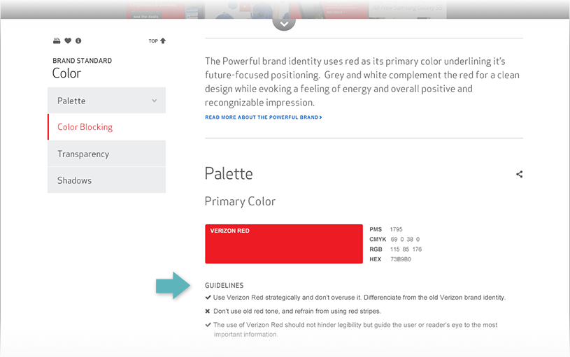
Aside from the limitations of PDF, the brand guidelines as-is presented a number of issues and challenges. From page to page, guidelines varied in structure, often duplicated content, and were sometimes missing content. Overall, the various guidelines felt disparate and disconnected.
With so much detail trapped in a single PDF, we devised a systematic approach for translating that content for the web.
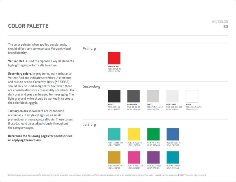
Brand guidelines PDF excerpt
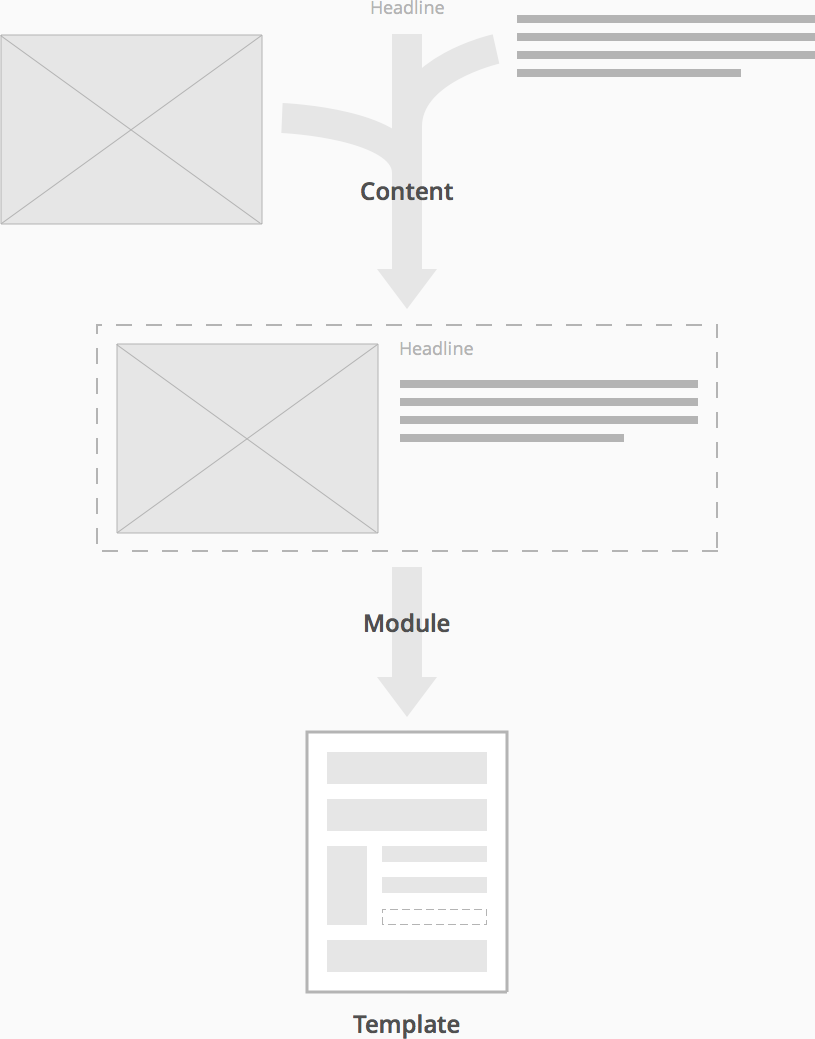
We started by performing a content audit, combing through the current guidelines to identify content gaps and streamlining opportunities. We uncovered an underlying content structure, created by the things guidelines had in common. This structure could be applied to and repeated for each guideline, establishing a consistent and understandable way of reading content on the page.
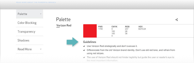
Repeatable page structure
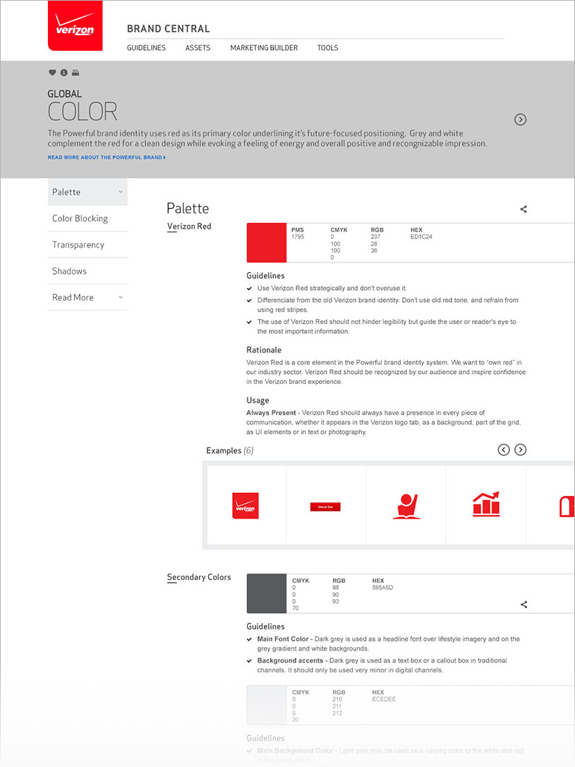
- Page
- Brand Standards > Color
- Section
- Palette
- Subsection
- Primary Color
- Content
- Guidelines
- Rationale
- Usage
- Examples
We then consolidated any content repeated across guidelines. For example, instead of the global color palette repeating in each of the web, print, and TV guidelines, the palette would only appear in Brand Standards, then linked to within each channel-specific guideline where relevant.
For any content gaps or existing content that needed some finessing, we brought in a content strategist and copywriter to help with content creation and editing. We also partnered with Verizon's traditional agency, splitting the digital and traditional content work between us.
Thinking modularly
After meeting with Verizon's technology team, we considered CMS limitations and time constraints to determine what could be done realistically without compromising on the experience of using Brand Central. The experience for authors would take a blow, but more on that later.
For this first phase of translating guidelines for the web, we devised a single page template that would accommodate all guidelines content. The template would be made up of modules, based on the content work done so far. Once both the template and its modules were defined, built, and integrated into the CMS, the plan was to roll out pages over the coming months as content is revised and finalized, making minor adjustments to the template and modules along the way.
Using the content and structure detailed so far, we took a pass at creating 3 wireframes to stress test our structure using different sets of content from each of the 3 guideline types.
First pass wireframe
Top of the page
Bottom of the page
Anticipating the technology team's needs, I broke out the wireframe into discrete modules. During this process, I consolidated similar modules, treating their differences as attributes that could be turned on or off.
Consolidating similar modules
- Guidelines Module
- Base
- Guidelines Module
- Variation 1
- Guidelines Module
- Variation 2
After reviewing wires with the client and tech team, we felt confident about nailing down the guidelines page template and detailing CMS requirements. I began to differentiate modules that would be persistent across pages from those that would vary across sections of a page. To clearly illustrate this, I abstracted out the wireframes into a single high-level template.
Fixed and flexible modules
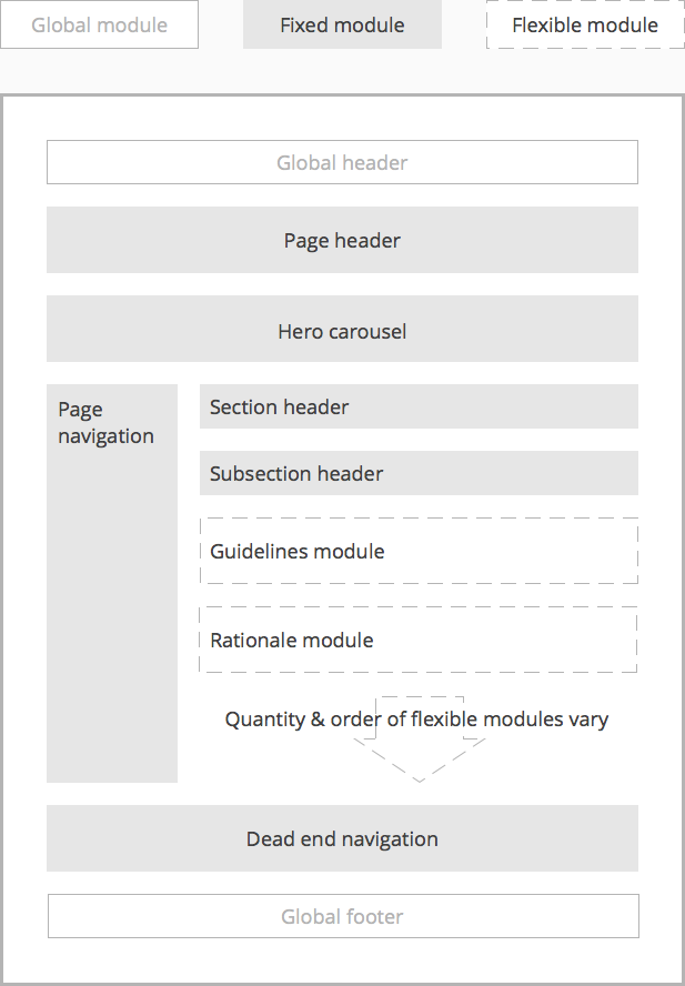
I would go on to detail front-end specifications and CMS requirements, from on-page interactions to how the author would be expected to build a page in the CMS.
Design and testing
While I iterated on wires, our visual designer started defining the visual style that would be used across guidelines pages based on the wireframes. Eventually, iterations were done directly in visual design, meeting quickly to sketch ideas, then letting our designer do his thing.
First pass comp
To test our design with users, I worked closely with our designer and front-end developer to fine-tune page design and on-page interactions. We built a prototype, which was used both for user testing and communicating with stakeholders and team members.
When testing, we were most interested in seeing how users navigate the page, consume content, and interpret the taxonomy used. Given the length of the page, we used a sticky, left-hand navigation for way finding purposes and to quickly move between page sections.
During testing, we discovered that users often visit Brand Central for inspiration and best-in-class examples, with some only referring to the guidelines to see if their work is off-brand. In response, we made a new addition: a hero carousel showcasing a few best-in-class examples at the top of the page.
Prototype
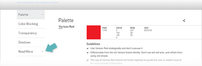
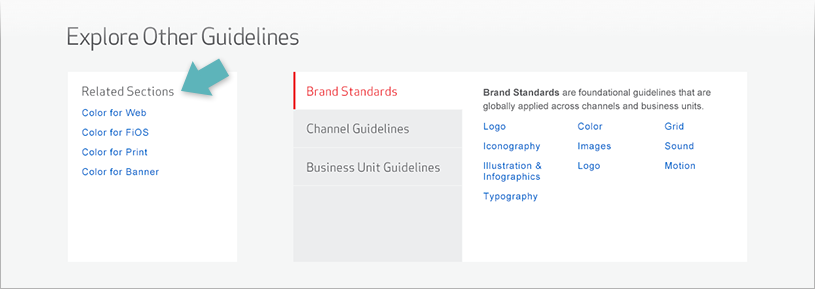
We also made a number of other changes – some were based on user testing, while others were made to address IA, technical, or aesthetic issues we noticed.
Related guidelines
Before
After
Indented content
Before
After
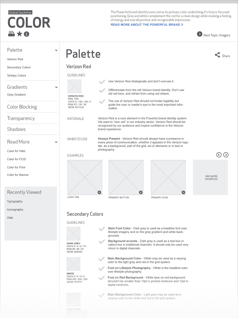
Final design
Top of the page
Bottom of the page
Conclusion
Our front-end developer was a huge asset, not only in building the prototype, but also in our dealings with the technology team. We worked together very closely to determine the authoring experience on the CMS side, and coming to an agreement with the tech team around what needed to be done within budget and time constraints.
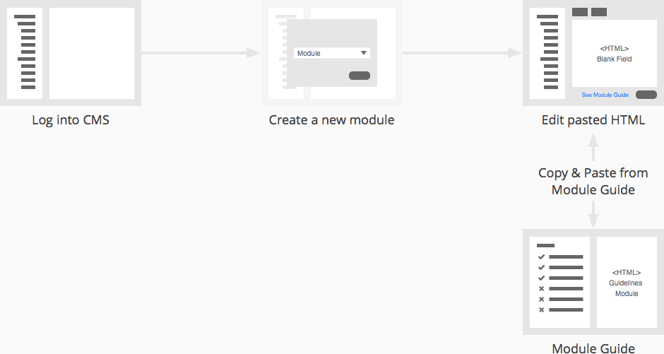
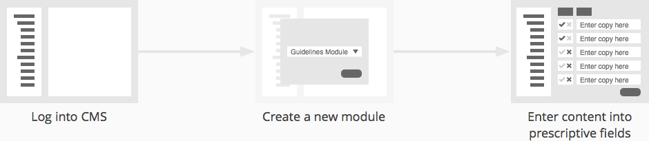
We agreed on a phased approach over the next 3 quarters, moving from open HTML fields to a more intuitive experience using prescriptive form fields.
CMS phase 1
CMS phase 3
The SapientNitro team would be authoring these pages in the CMS, and, as a digital agency, editing content in HTML isn't a problem. However, Verizon's traditional agency would be authors as well, and would have a tougher time of it. It's not the ideal situation, but their traditional agency agreed to this approach so long as guidance and training materials are provided.
Unfortunately, I didn't get to see this project to the end. At the time of writing, the detail around authoring tools were still under discussion with Verizon's tech team. The goal was to provide both authors and site users, the best experience possible, but, sometimes, there's only so much time and money in the pot.
Stakeholders and users alike, expressed lots of enthusiasm around the improvements being made. If things go as planned, at least the users of the site will get the experience we set out to create.