Shutterstock Product Page

Back to top

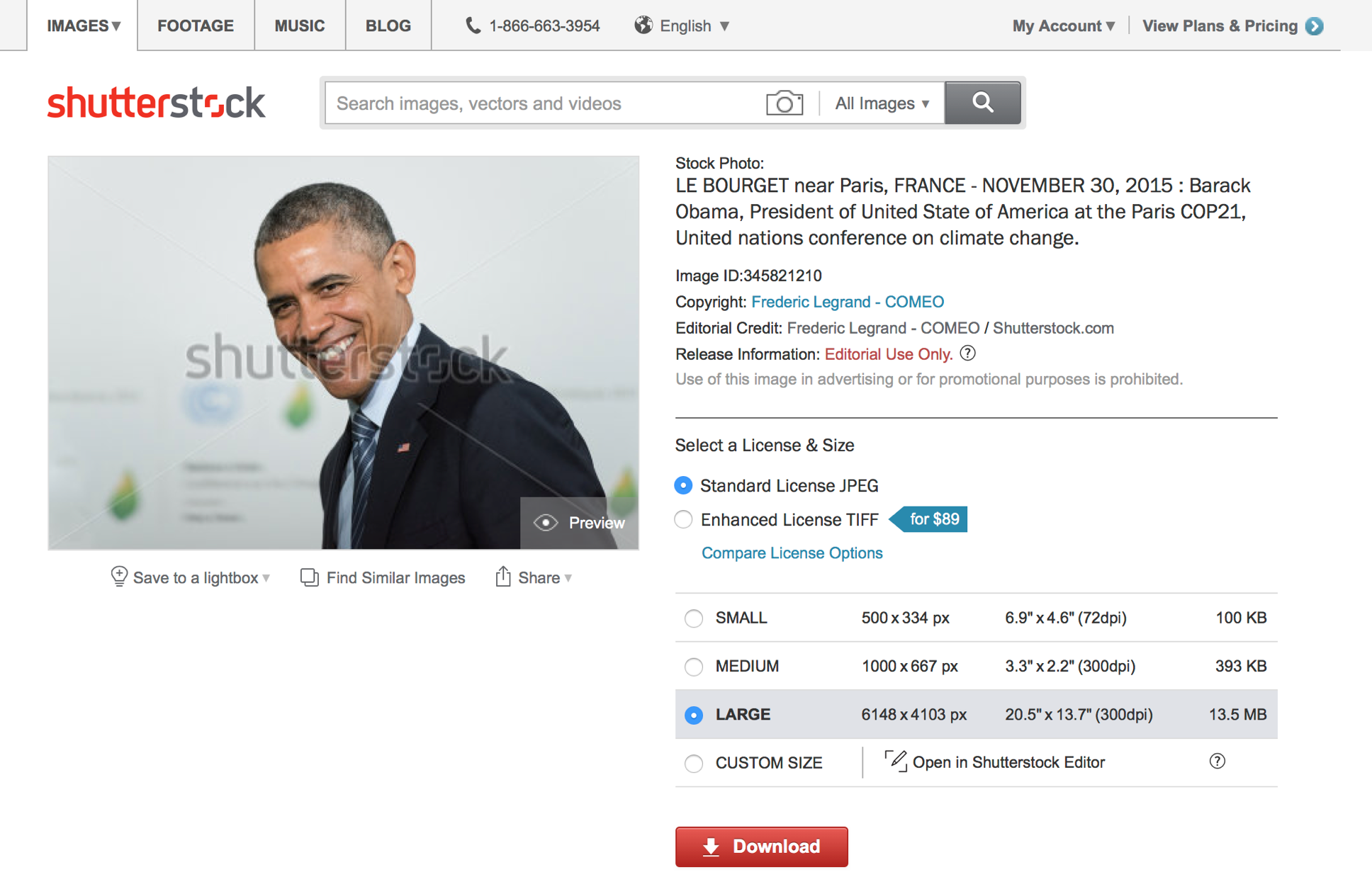
Customers go to the product page to download & see details about an image, but it can be unclear what they're buying. In a search for the right image, the page also feels like a dead end.

Try focus mode

Overview

For 2016, Shutterstock set a goal to migrate all of its pages to a modern tech stack, enabling teams to build features they previously couldn't, and ship them faster. Each migrated page was an opportunity to push the current experience forward in a meaningful way.

New design

Clickable presentation below

Problems

  • Confusing product details
    resulting in a significant portion of customer support cases
  • Multi-page download flow
    that adds a lot of friction to the workflow of many customers
  • Painful keywords game
    when searching for the right image
  • Lack of feature engagement
    with mission critical features

Goals

  • Empower customers
    to make confident, more informed download decisions
  • Simplify download flow
    so it's fast, frictionless, clear, and keeps the user moving through their workflow
  • Improve discovery paths
    by making them more discoverable and useful
  • Improve feature discoverability
    of Editor, and other features on the page

At the time of writing this (October 2016), the new product page is on the roadmap to be built early Q4 2016 – as early as this month.

My role

I was the lead designer and the supporting researcher on this project. My contributions included:

  • Design, including early sketches, prototypes for research, and the resulting design based on research
  • Research planning, including what we want to learn from, ask of, and test with customers
  • Conducting research sessions and synthesizing learnings

Team

  • my role on the team
  • UX teammate
  • Designers
  • UX researcher
  • Researcher
  • Director of UX
  • UX Director
  • Product owner
  • Product owner

Deliverables

  • Current state audit
  • Prototypes for user testing
  • Research findings summary
  • A new design

Toolbox

  • Sketch
  • InVision
  • Google Docs
  • GoToMeeting

Current state

The product page is how customers primarily download images, see details about the image, and evaluate the image at a larger size.

New product page

We saw 4 key areas for improvement:

  • Discovery of new, related content
  • Download flow
  • Information density of the image details
  • Discoverability of features on the page

Feels like a dead end

Clickable presentation below
Many customers lean on search results and only come to the product page to download, with either no awareness or perceived value in the other features and pathways we provide today.

Multi-page download flow

Clickable presentation below
Customers also tab out several product pages in their browser at a time, then evaluate, narrow, and download later. Especially for these customers, the current multi-page download flow adds friction to their workflow.

Customers tab out several pages, then download later...the current flow adds friction

Page overview

Clickable presentation below
3 main components make up the page: the image, the details next to it, and the discovery paths below.

Dense image details, hidden features

Clickable presentation below

Buried discovery paths

Clickable presentation below

Goals & questions

From a design perspective, there's a lot we can do here to not only improve the customer experience, but also help out our customer service team, other teams responsible for features on this page, and drive business value.

Goals

  • Empower customers
    to make confident, more informed download decisions
  • Simplify download flow
    so it's fast, frictionless, clear, and keeps the user moving through their workflow
  • Improve discovery paths
    by making them more discoverable and useful
  • Improve feature discoverability
    of Editor, and other features on the page

Success metrics

  • Increased downloads
  • Increased discovery path engagement
    and resulting downloads
  • Decreased customer support time
    spent clarifying sizes and licenses
  • Decreased refunds
    based on mistakenly purchased licenses
  • Increased Editor engagement
    and engagement with other features

...but if we're going to do this, we need more information. There are some unanswered questions like, what details actually matter to customers? Also, did we miss anything?

What we wanted to learn

  • Overall
  • What do customers do now on the product page?
  • How and why do they go there? Where do they go next?
  • What features do they use? How? Why?
  • Search behavior
  • How do customers find the image they need?
  • What role do discovery paths play, if at all?
  • Downloading criteria
  • What do customers look for when deciding to download an image?
  • What do they look for in the details about the image? In the image itself?

What do customers look for when deciding to download an image?

Research findings

We talked to customers to understand their current needs and behavior, and test designs varied in:

  • What and how much information we show on the page
  • How many steps it takes to download, and what you see at each step
  • Discovery path placement, as well as size
  • How we communicate Editor and other features

2 rounds, 6 customers each

  • Round 1 focused on...
  • Information density
  • Discovery paths
  • Round 2 focused on...
  • Download flow
  • Editor & other features
  • 12 customers varied in...
  • Download frequency
    frequent, infrequent
  • Plan / account type
    subscription, on demand, lapsed plan, free account
  • Size downloaded
    S, M, L, supersize
  • License type needed
    standard, enhanced
  • Feature usage
    lightboxes, editor, none at all

Here are some highlights from testing information density, size details, and discovery path variations.

Information density variations

Clickable presentation below

Size display variations

Clickable presentation below

Customers want to make sure large is actually the largest available

Discovery path variations

Clickable presentation below

New design

Based on research, I landed on the version you see below and rolled off the project shortly after. It's not the final version, but it's very close to where the next designer ended up.

Click through below to see the highlights.

New design highlights

Clickable presentation below

Old design, for comparison

New product page

So, is the new one actually better? TBD based on whether it...

  • Increases downloads
  • Increases discovery path engagement and resulting downloads
  • Decreases customer support time spent clarifying sizes and licenses
  • Decreases refunds based on mistakenly purchased licenses
  • Increases Editor engagement and engagement with other features