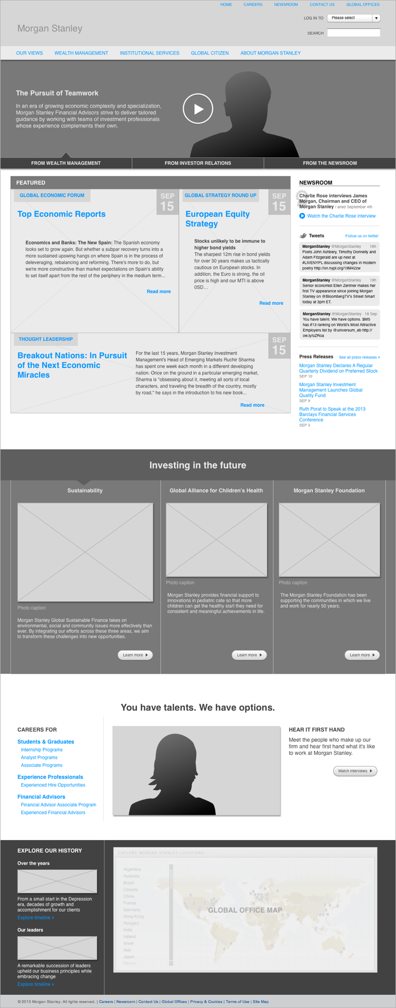
The Morgan Stanley homepage was intended to be a launching point into industry-wide news, research, and thought leadership content, but the page design as-is wasn't doing its content justice.
The challenge
Morgan Stanley tasked my team at SapientNitro with redesigning their homepage and other key sections of the site, focusing on content. However, there were certain things that could not change with the redesign, at least not right away. We needed to consider that parts of the site such as the global header and navigation, and most of the other pages, would remain the same.
By the time I joined the project, our content strategists had already performed an audit of the Morgan Stanley site, identifying problem areas and opportunities for improvement. Among problem areas on the homepage were some big ones related to both design and content, including:
- Stale content, with some articles over a month old
- Uninteresting content presentation, with little to hook visitors and encourage click-through
- Buried content from key areas of the site that merit prominent real estate
- Minimal representation of Morgan Stanley's brand identity and core values

However, among the opportunities identified was a huge one: there's lots of great content to work with, they just aren't being used on the homepage.
The homepage was the first of several pages that we worked on. It defined the patterns and style that would carry on throughout the rest of our work. As the most impactful change to the site, the homepage redesign is the primary focus of this case study.
“...there's lots of great content to work with, they just aren't being used on the homepage.”
What I did
With content strategy so well-documented, ramp up was a breeze and I started on wires almost immediately. After reviewing with the client, our designer went to work mocking up the homepage. While working on other pages, I would spend time iterating with the designer, talking through ideas and doing quick sketches as needed.
When the homepage design was nailed down, with only minor tweaks to be made, I began spec-ing out the more nuanced details of the page for the tech team. Using the homepage comp and specification, the tech team would share their work in progress for feedback. We went through just a few feedback cycles before the page was ready for go-live.
I had a lot of help
-

-

- Experience designers
-
-
- Content stategists
-
- Visual designers
What we delivered
- Content audit
- Annotated wireframes
- Comps
My toolbox
- Omnigraffle
- InDesign
Content recommendations
The content audit provided, not only high-level recommendations, but detailed ones as well. In regard to the homepage, content strategy assessed the relevance and importance of content across key sections of morganstanley.com, as well as a few microsites.
Content audit excerpts
- Content area
- Assessment
- Recommendation
- Header navigation
- Careers only appears in the nav and should have a larger homepage presence
- Break out Careers content to occupy more real estate on the homepage
- Our Views
- Global Economic Reports are highly valuable to readers
- Highlight 1-3 of most recent top economic reports on homepage
- Wealth Management
- Contains key brand messaging and content representing core values
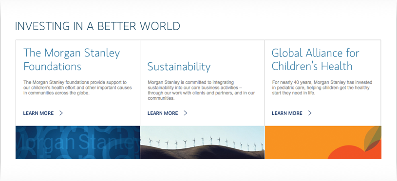
- Bubble up this content to the homepage carousel
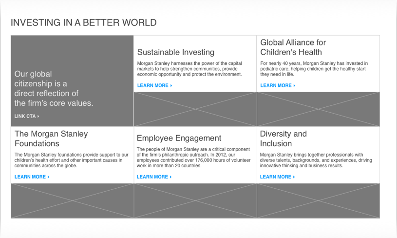
- Global Citizen
- Important message here: MS has the RIGHT long-term relationship to sustainability
- Surface sustainability content to the homepage
After getting familiar with the content strategy, I set a few goals to address when drafting the initial wireframe and presenting it to the client. Namely, the homepage should:
- Feel fresh and relevant with the latest content
- Present content in a visually compelling way
- Surface content from key areas of the site, while giving each piece a logical place in the page's story
- Reflect Morgan Stanley's priorities and values
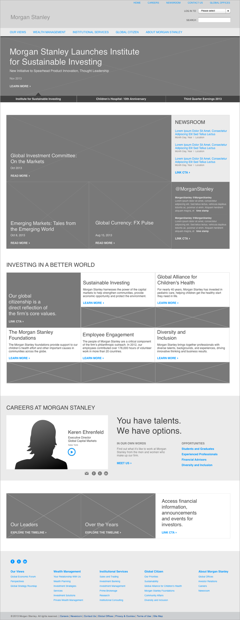
To begin addressing these, my first pass wireframe surfaces the latest news at the top, with information about Morgan Stanley as a company following down the page. This includes a prominent space for Careers content towards the bottom.
First pass wireframe
Upon reviewing with the client, we made sure that they felt we were addressing the problem areas of the current homepage. We also checked with the client and their technology team to make sure we could achieve everything proposed in the wire, including surfacing article excerpts and keeping the homepage fresh with new content.
What changed
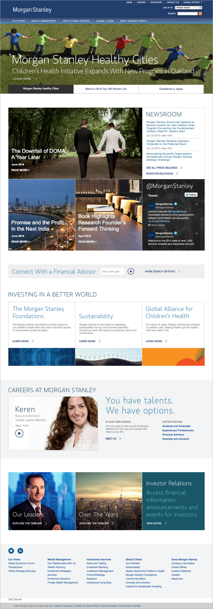
Everything we proposed was possible and would go through just a few iterations before reaching the final design.
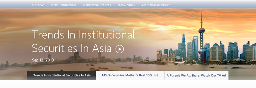
To clean up the hero carousel, we:
- Introduced a full-width background image
- Replaced the number indicators with explicit titles for each carousel position
- Reduced the amount of copy, letting the title breathe and bringing the background image forward
- Moved announcements content into a news section below
Hero carousel
Before
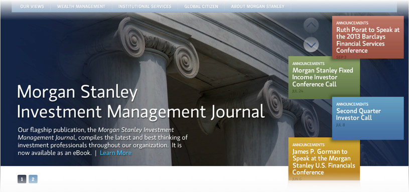
After
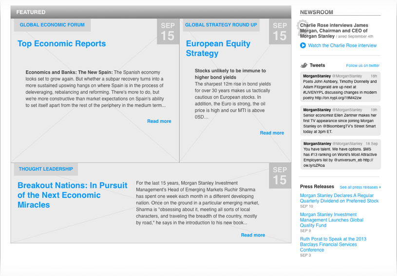
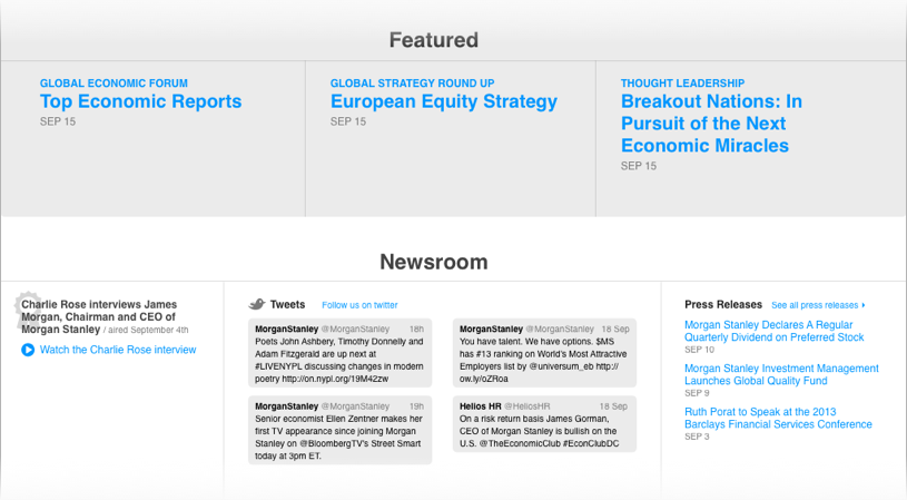
The main concern with the news section was surfacing just enough content to encourage click-through, without overwhelming the user or creating an unbalanced page.
News section iterations
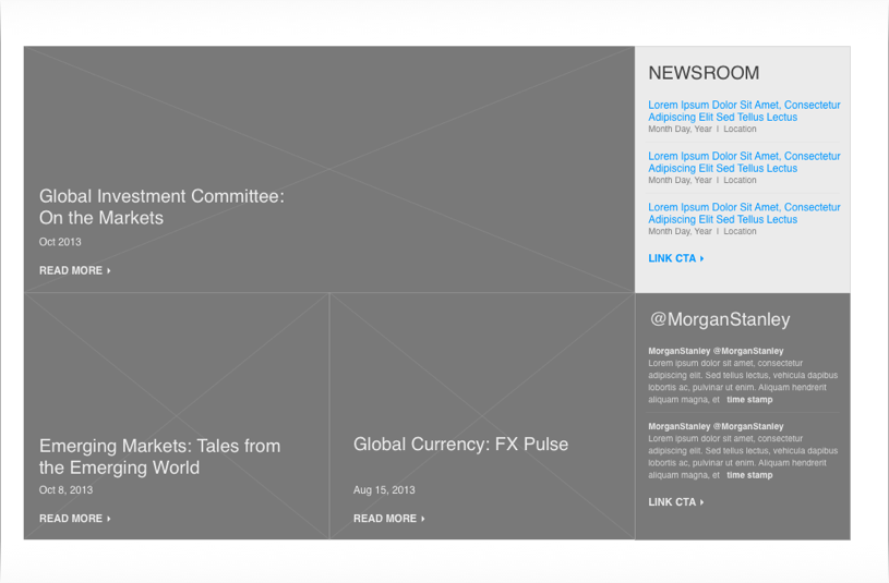
Wireframe iteration 1
Wireframe iteration 2
Wireframe iteration 3
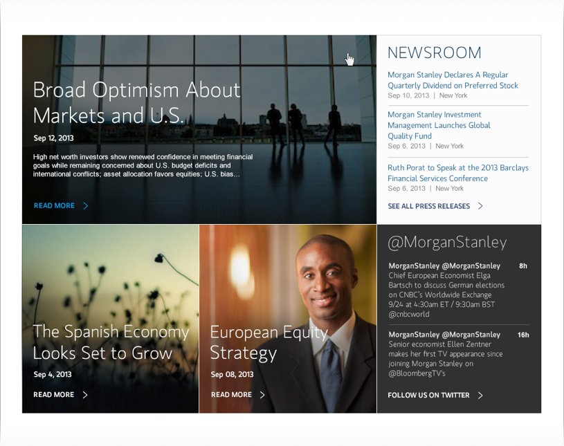
Comp based on final wire
“The main concern with the news section was surfacing just enough content...without overwhelming the user...”
Eventually, we got to a point where updating wires didn't make sense. Any final changes were made directly into the comp, then eventually in the code itself.
Skip the wires, update the comp
Wires with dated design
Comp with design feedback incorporated
“Any final changes were made directly into the comp, then eventually in the code itself.”
Conclusion
In the end, the wireframe and the comp were pretty close in terms of how content appears on the page. This project was a great example of how good content strategy can capture and align user needs and business priorities in a way that makes a huge impact on design and how we communicate ideas with the client.
Final wireframe
Final design
At the time of writing, our work on the Morgan Stanley homepage is live.