While iHeartRadio has over 60 million registered users, many of those users aren't actively engaged with the product and drop off within the first 30 days of use.
The challenge
iHeartRadio let’s you listen to live radio, artist-based radio, and podcasts from your iPhone or Android phone. However, the product faces a number of issues from design and usability to how customers perceive iHeartRadio as a brand and in what the product offers, resulting in:
- difficulties appealing to and acquiring new segments of users, and retaining them, particularly in the first week of use
- difficulties engaging and retaining existing users
- a lack of growth in terms of the content users listen to
- a lack of meaningful growth in time spent in the app or listening to content
For the most part, iHeartRadio users just listen to what they know: either live radio stations they know, or artists they know using artist-based radio. A very small percentage of users listen to both, and most will listen to the same stations repeatedly, which speaks to the need to improve the current discovery experience.
iHeartRadio users just listen to what they know
These are some of the problems I knew starting out, based on information provided by the analytics team, product managers, and creative leadership. However, coming out of the initial brief, there were a lot of outstanding questions about the source of these problems and other problems that may exist.
Redesign
What I did
To come up with informed and effective solutions to the problems mentioned, I would assess the current state of the product in detail, run user tests to answer some crucial questions and validate assumptions, analyze competing music streaming services to better understand the current landscape, and then dive into design exploration with a clearer understanding of the product’s core issues and where the team wants to take it.
Largely, I worked on my own, while getting regular feedback from product managers, creative leadership, and the product owner. While I had one partner who focused on the Android side of things, while I focused on iOS, the work seen below is mine alone.
The team
-

-

- UX designers
-
- Product owner
What I delivered
- App audit
- User test findings
- Design explorations (IA, wires, prototypes)
My toolbox
- Sketch
- Framer
- Omnigraffle
- InDesign
- UserTesting.com
- Google Docs, Sheets, & Slides
Auditing the app
As one of my first project’s at iHeartRadio and as someone who had not used the mobile app prior to working there, the audit was an opportunity to really familiarize myself with the app and evaluate it as a first-time user might, with fresh eyes.
After a few days of use, I found myself gravitating toward just the top level of the app, and search. To really get into the nooks and crannies of the app, I started by doing an inventory of all the screens in the app. To more easily digest this mapping of screens, I abstracted all the different screens into types based on the main purpose of each. The hope was that this abstraction would make it easier to see patterns and identify problems like redundancies and poor organization of content and features.
Abstracted screen types
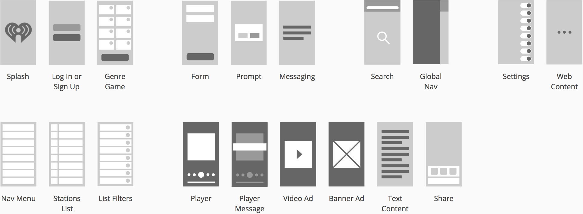
...this abstraction would make it easier to see patterns and identify problems
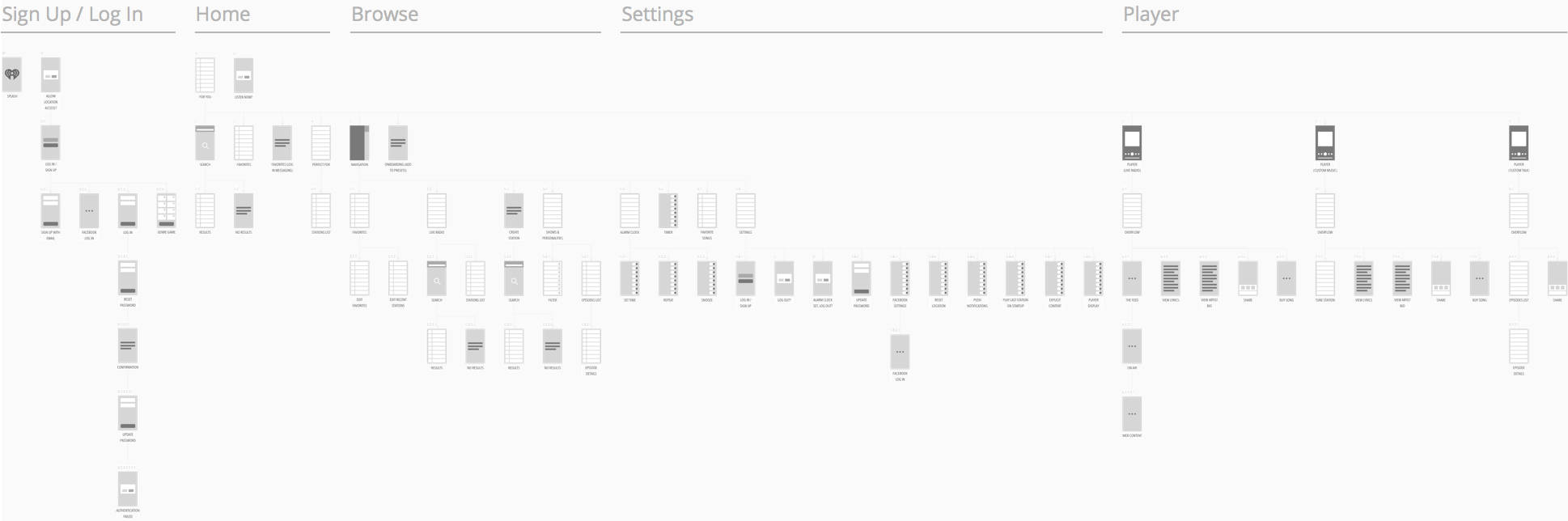
When mapping out the screens, I organized them by “neighborhoods” to make them easier to speak to during internal reviews and working sessions.
Screen inventory
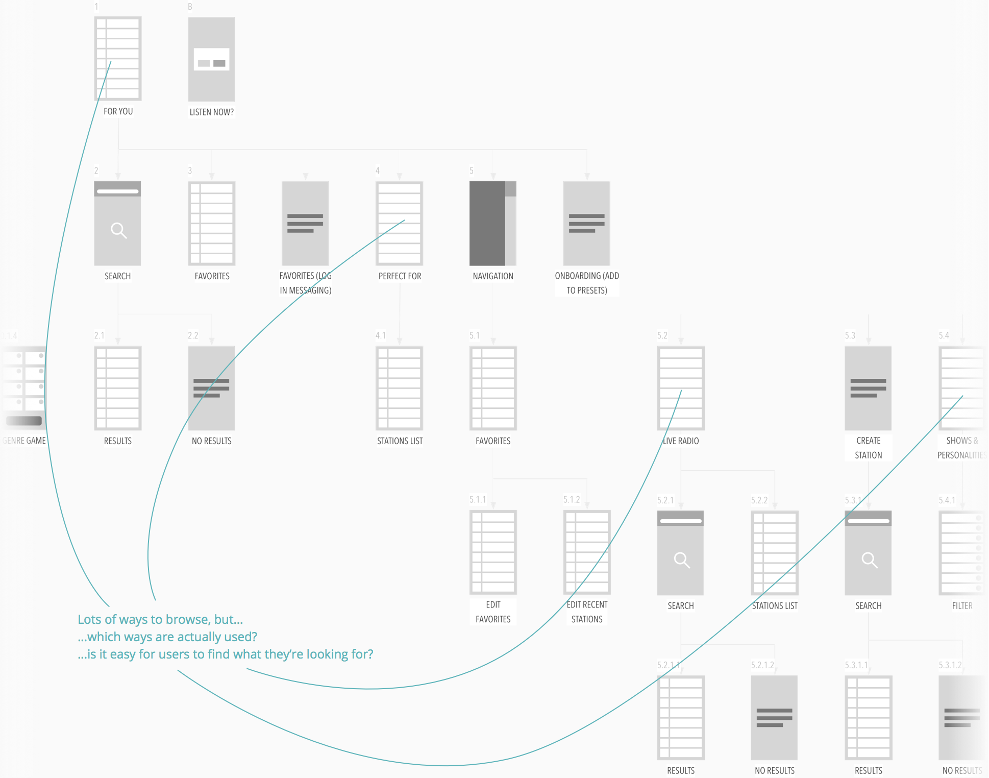
At the IA level, two of the big things we found were:
- there’s lots of ways to browse, maybe more than is valuable
- there’s some very hidden, potentially valuable, content, most of which only exist in a web wrapper or kicks you out of the app and into a browser
Identifying potential issues in IA
At the UI level, there were a lot of questions that analytics and usage data just couldn’t answer on their own.
Identifying potential issues in UI
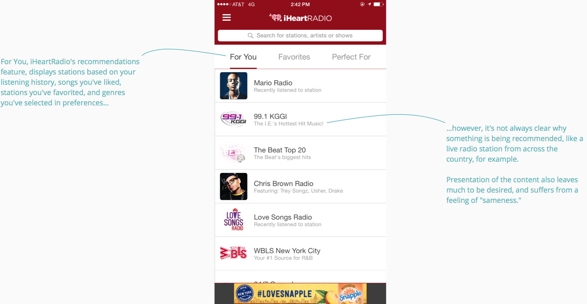
While going through the UI, I noticed a lot of elements that looked very similar, but were actually very different types of content or behaved differently. There would also be a content type presented only slightly differently in different contexts, but the reasoning why wasn’t immediately clear.
As mentioned before, the way content was presented had a general feeling of “sameness,” which, without some visual hierarchy, made it difficult to distinguish discrete pieces of content from one another. I had a hunch that this played a significant role in why discovery of new content was so low among users.
...the way content was presented...made it difficult to distinguish discrete pieces of content from one another
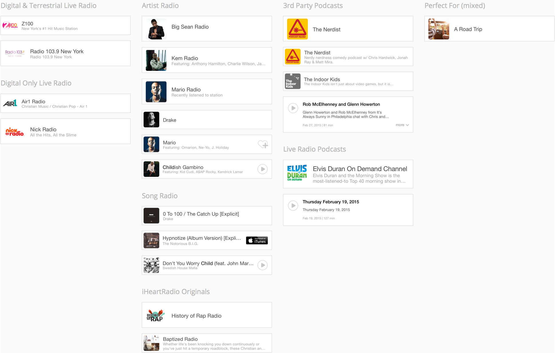
To better evaluate this issue, I broke the UI down into just those discrete pieces of content, pulling in just the unique instances of each per type. This would help later on in design exploration to determine a more effective way to organize and present the different types of content.
Interface inventory
By content type
User testing
After a detailed look at the current app, I had a lot of questions that could not be answered with the information available from the team. I looked to user testing to answer these and fill in some of the blanks of what we do know.
Questions by theme
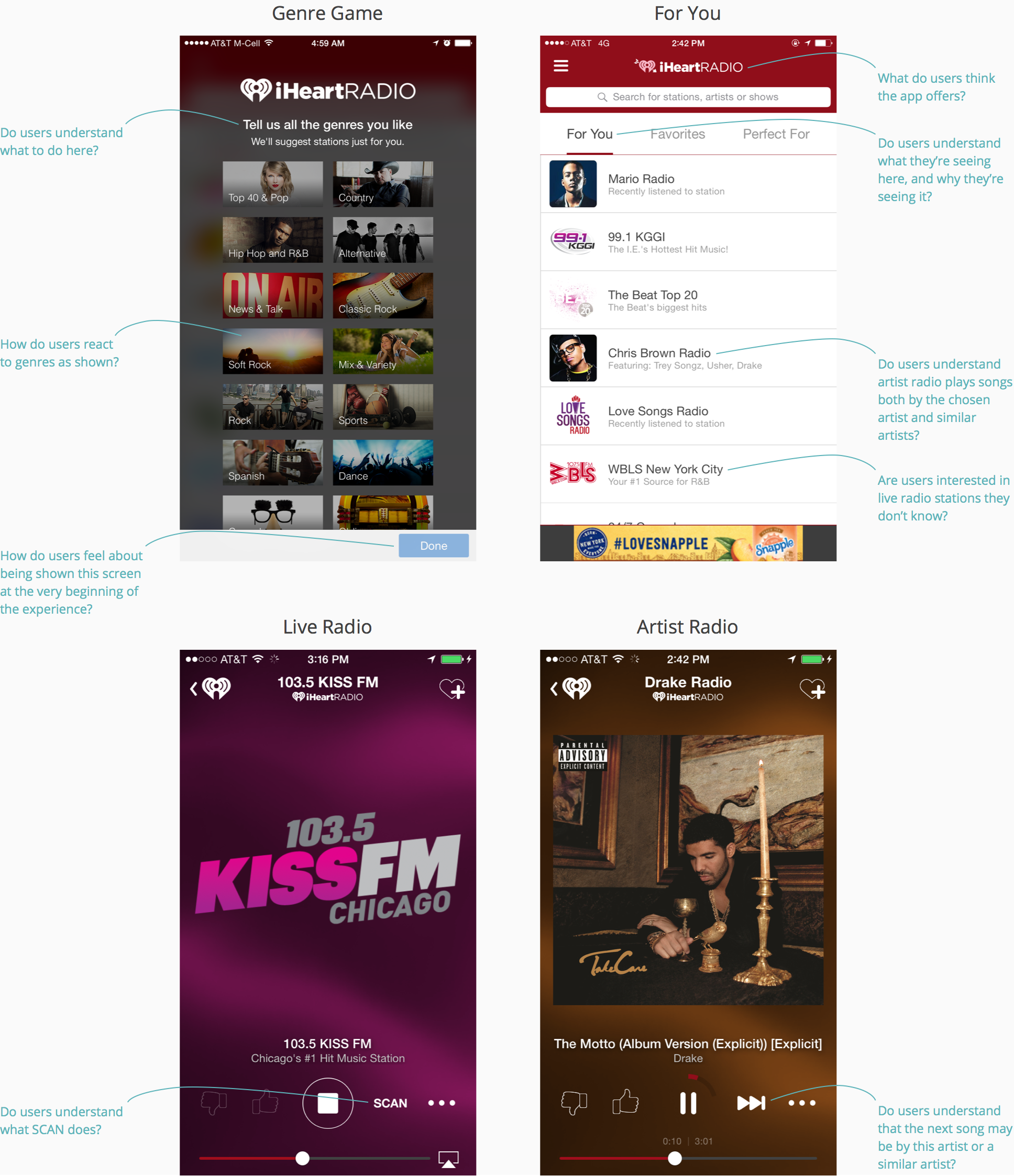
- Onboarding
- What are users’ initial feelings / reactions upon launching the app?
- Do users understand the purpose of the Genre Game? How do they feel about it?
- Do users understand what the app offers?
- Upon completing the Genre Game, how do users find something to listen to? What do they gravitate toward?
- When presented the Registration Gate while using the app, do users understand they need to sign up to access certain content and features?
- How do they feel about being prompted to Sign Up at these different points?
- The Player
- Do users understand what Scan means?
- Do users understand what the Skip button does in Artist Radio?
- Do users understand what Thumbs Up and Thumbs Down do in Artist Radio? Live Radio?
- Do users understand what Artist Radio is? Can they easily distinguish between Live Radio, Artist Radio, and Podcasts?
- Content & Navigation
- How effective is For you? Do users understand what is presented in the list?
- When would users look for content outside of For you and Search? Where do they look?
- How does usage of For you compare with Search?
- After familiarizing themselves with the app, how are users most inclined to find content they know or discover new content to listen to?
- Do users know how to find something they’ve listened to recently?
- After adding a station to their Favorites, do users know how to find Favorites?
- Do users have a preferred method for getting to their favorites? Is one method more effective than the others?
Based on these questions, I put together tasks and a test script, being very careful about phrasing and specificity to avoid biasing the user towards any one answer or behavior
Translating questions to user tasks
- Question
- Task
- Upon completing the Genre Game, how do users find something to listen to? What do they gravitate toward?
- You just want to try out the app. Open the app and try listening to something you enjoy, or seems interesting to you.
- Do users understand what Scan means?
- If you tap SCAN, what do you think will happen? Tap SCAN. What happens? Did it do what you expected?
- After adding a station to their Favorites, do users know how to find Favorites?
- You want to see the stations you’ve saved. Find a way to do this.
- After familiarizing themselves with the app, how are users most inclined to discover new content to listen to?
- You want to listen to something new – an artist or live radio station that interests you. Find a way to do this.
I recruited and administered tests through UserTesting.com, targeting new users only, and UserTesting.com provided videos of each test. I used a spreadsheet to record the behaviors of each user throughout the test, which I could then use to identify behavioral patterns and issues, and use as supporting evidence for findings.
Observations sheet
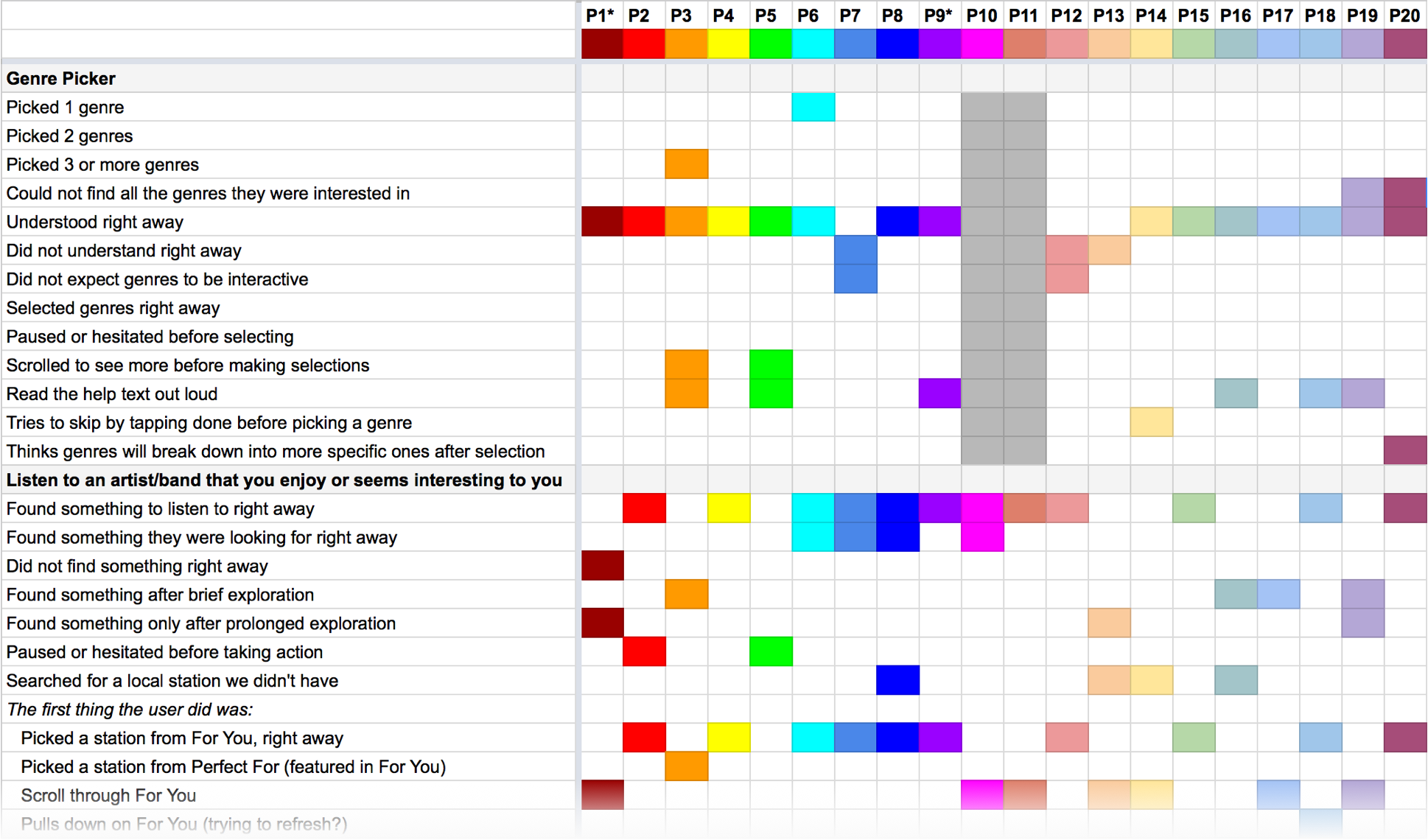
Some of the biggest issues I discovered had to do with a lack of clarity around content and features, and trouble navigating the app.
Top findings
- The good
- The bad
- While many listeners quickly understood they could listen to Live Radio stations...
- ...not all listeners saw or found their local stations right away, and were unsure why they were seeing live stations from other areas.
- While most listeners understood Artist stations right away, using Pandora as a point of reference...
- ...upon picking a station or skipping a song, many listeners were surprised to hear an artist or song, different from the one chosen, start to play.
- While most listeners understood the Genre Game right away...
- ...a few felt the genres shown did not accurately reflect their tastes, or expressed mild frustration that they could not skip to the next screen.
- –
- Scan was not easily understood by listeners, even after interacting with it, and even for those familiar with in-car Scan.
- While most listeners had little to no trouble navigating the app, or at least expressed no frustration towards navigation...
- ...upon tapping Back from the Player or Home from the hamburger navigation, many would momentarily get stuck on the Search Results where they expected to see For You.
- Upon completing the Genre Game, while most listeners tapped a For You station...
- ...after the initial station played, subsequent stations were mostly played from Search.
Navigation issues
While not necessarily an issue, most users relied on search, even when asked to listen to something new. In regards to recommendations, many were unclear on the content initially presented to them in terms of what they were seeing and why. I believe much of these issues stem from how content is presented and organized, and that the right content organization and visual treatment can help significantly improve the discovery experience and encourage users to more frequently engage with the app.
Design exploration
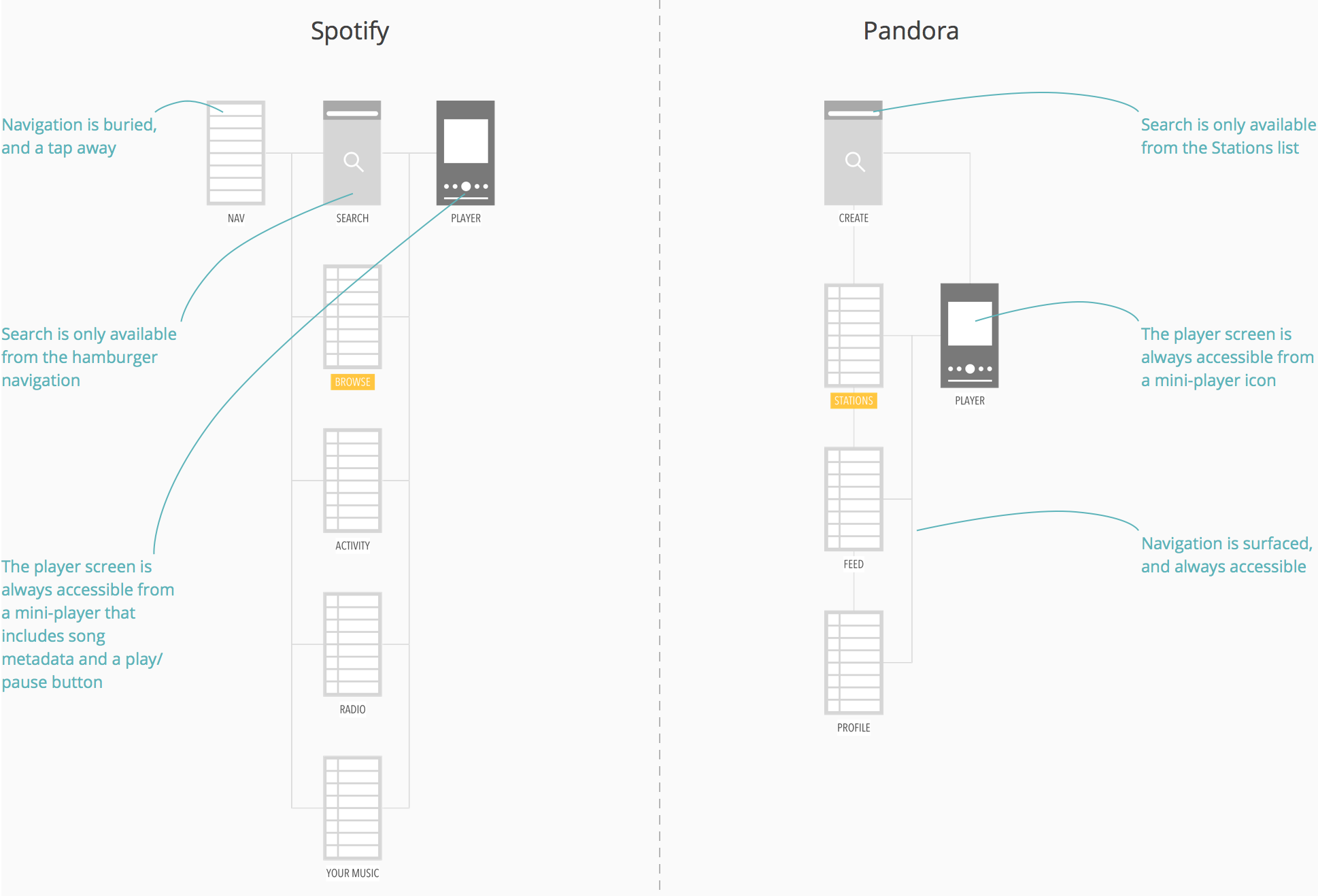
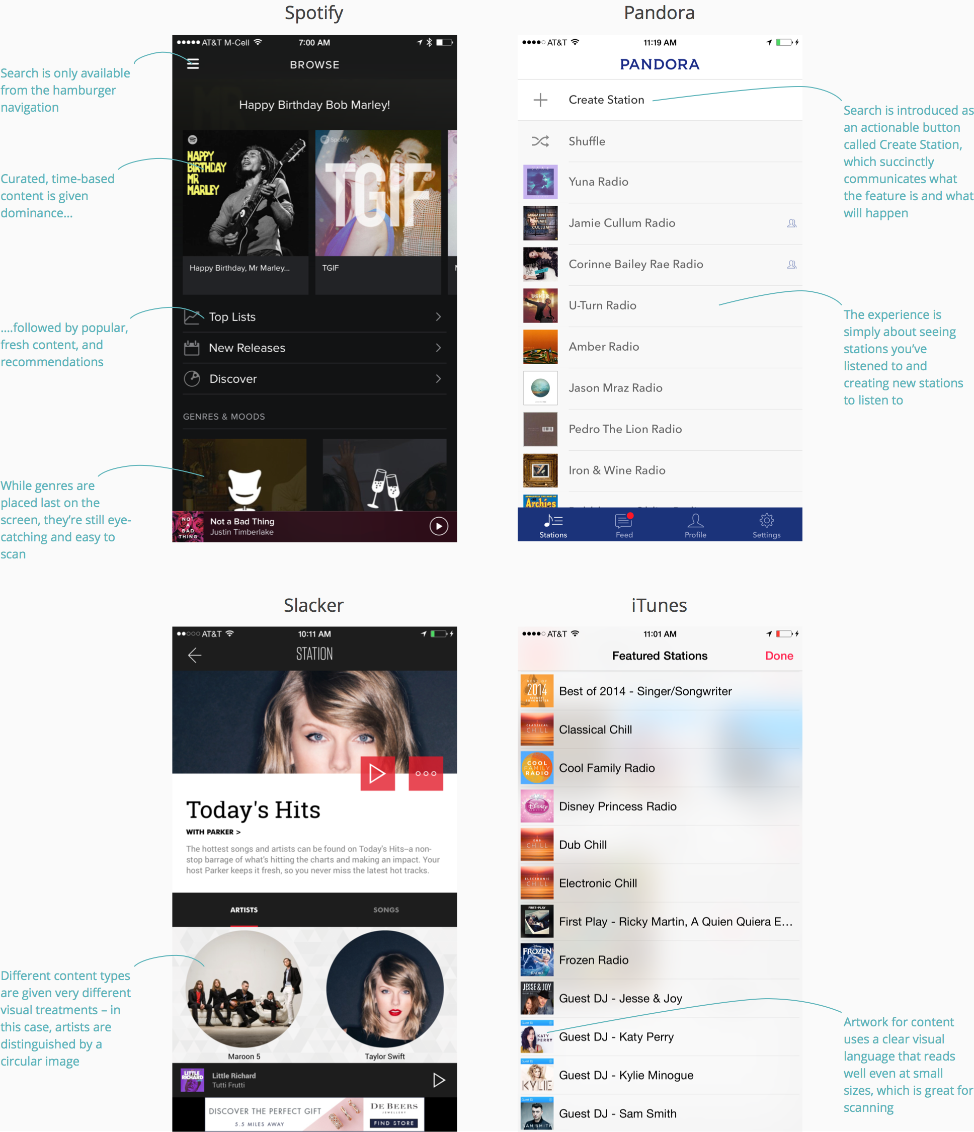
Before trying to solve some of the issues uncovered so far, I first took a look at what competitors are doing, specifically around how their apps are structured and the experience of browsing for and listening to music.
Two major differences between competitors from an IA perspective include:
- the use of a hamburger navigation compared with a persistent navigation tray
- the placement and behavior of search, where it's persistent and contextual in some apps, but global and tucked away in others
Competitive research for IA
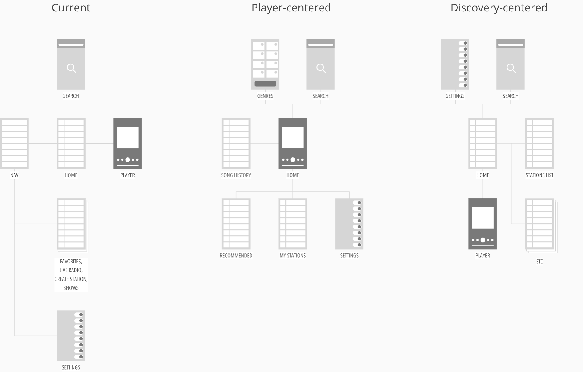
For the new IA, my goal was to distill the app to just the essential screens, and simplify the navigation to be more accessible.
Proposed IA
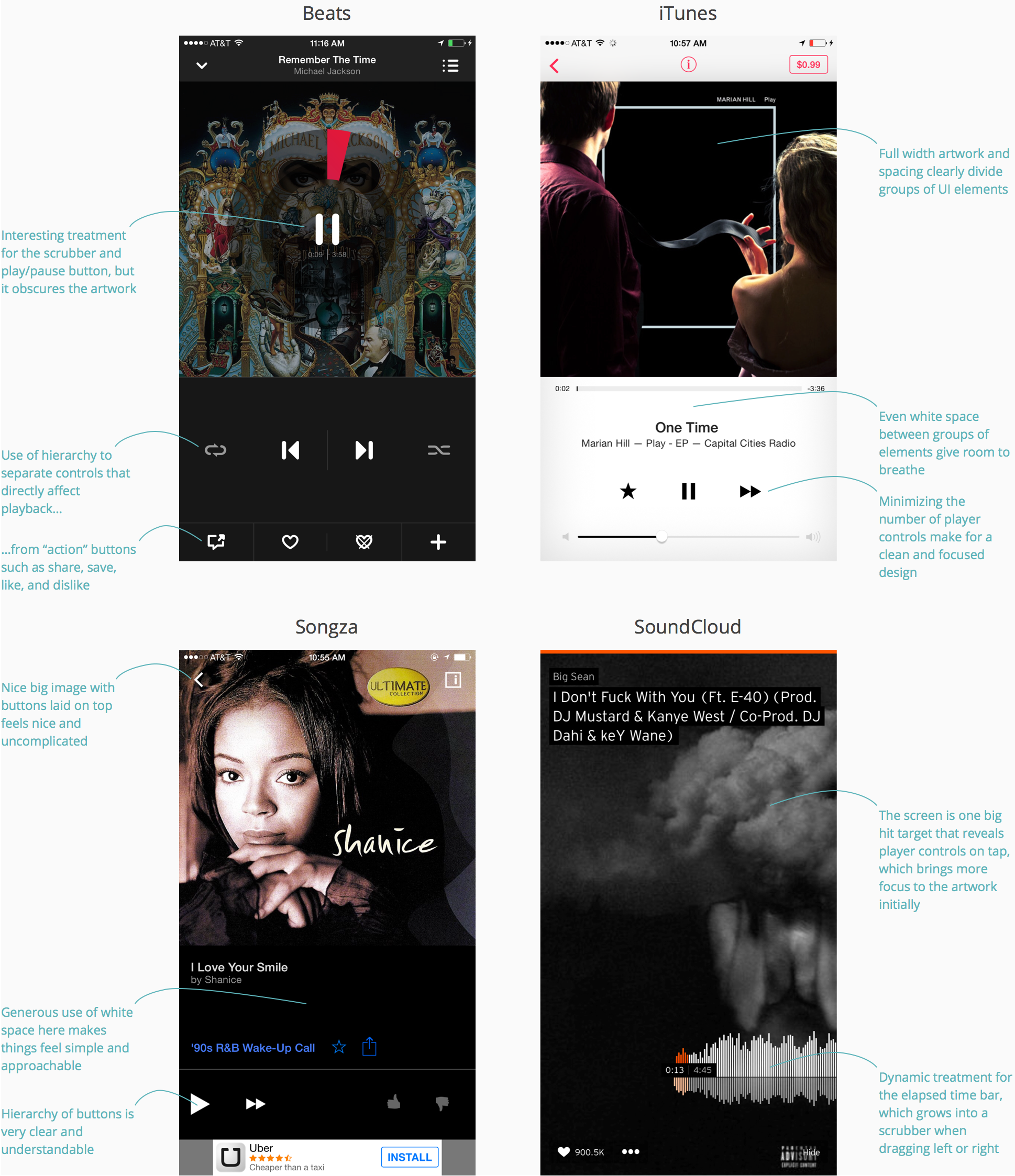
Competitors' player screens varied greatly from clean and minimal to very UI-heavy.
Competitive research for player experiences
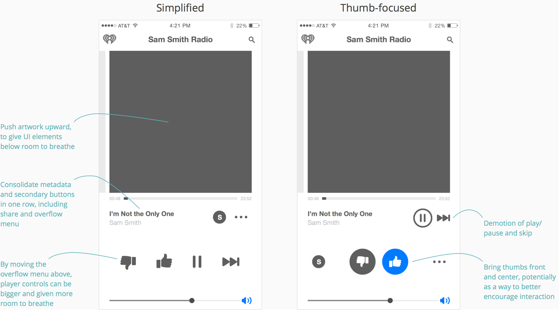
For the new player screen, I wanted to group elements in a way to encourage certain behavior while also giving the groups more room to breathe with clear separation between each other.
Proposed player
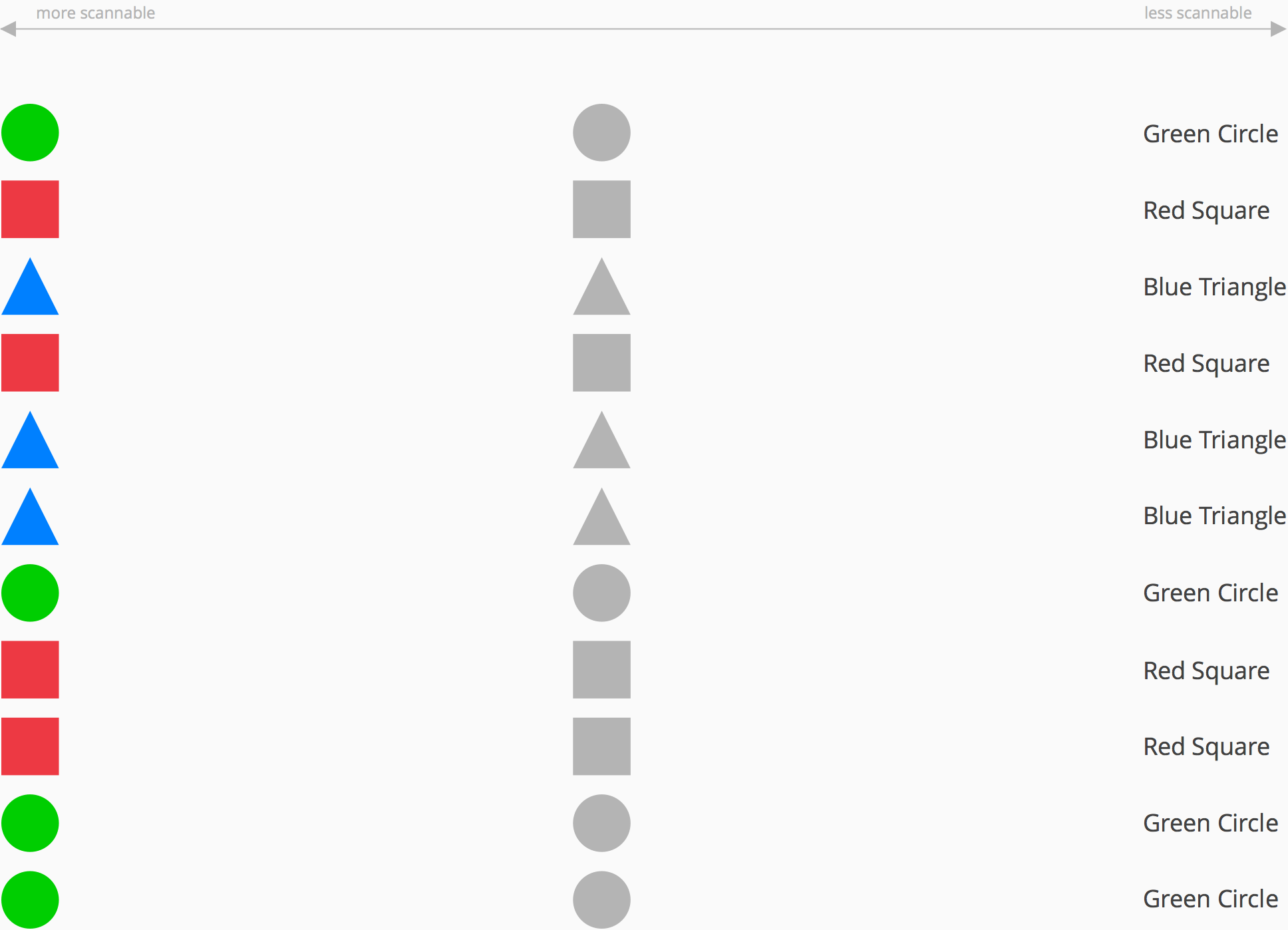
While reviewing work with the team, I wanted to give them a baseline for how to evaluate the effectiveness of a browsing experience to help get us on the same page.
Typically, you want to present just enough detail up front so users can easily scan through content and make somewhat informed decisions about where they'd like to dive in and start exploring something in deeper detail.
Scanning content
Depending on what the content is and how much of it is on the screen, you want to find the most effective form for that content to take so users can very easily find what they're looking for.
Scannability of content
There's a wide variety of approaches among competitors in terms of browsing experiences, which is reflective of their design philosophies and priorities for content and the audiences they're trying to serve that content to. While iHeartRadio's priorities may differ in ways, there was still a lot to be learned from dissecting what each competitor has done to help inspire the next iteration of the app.
Competitive research for browse experiences
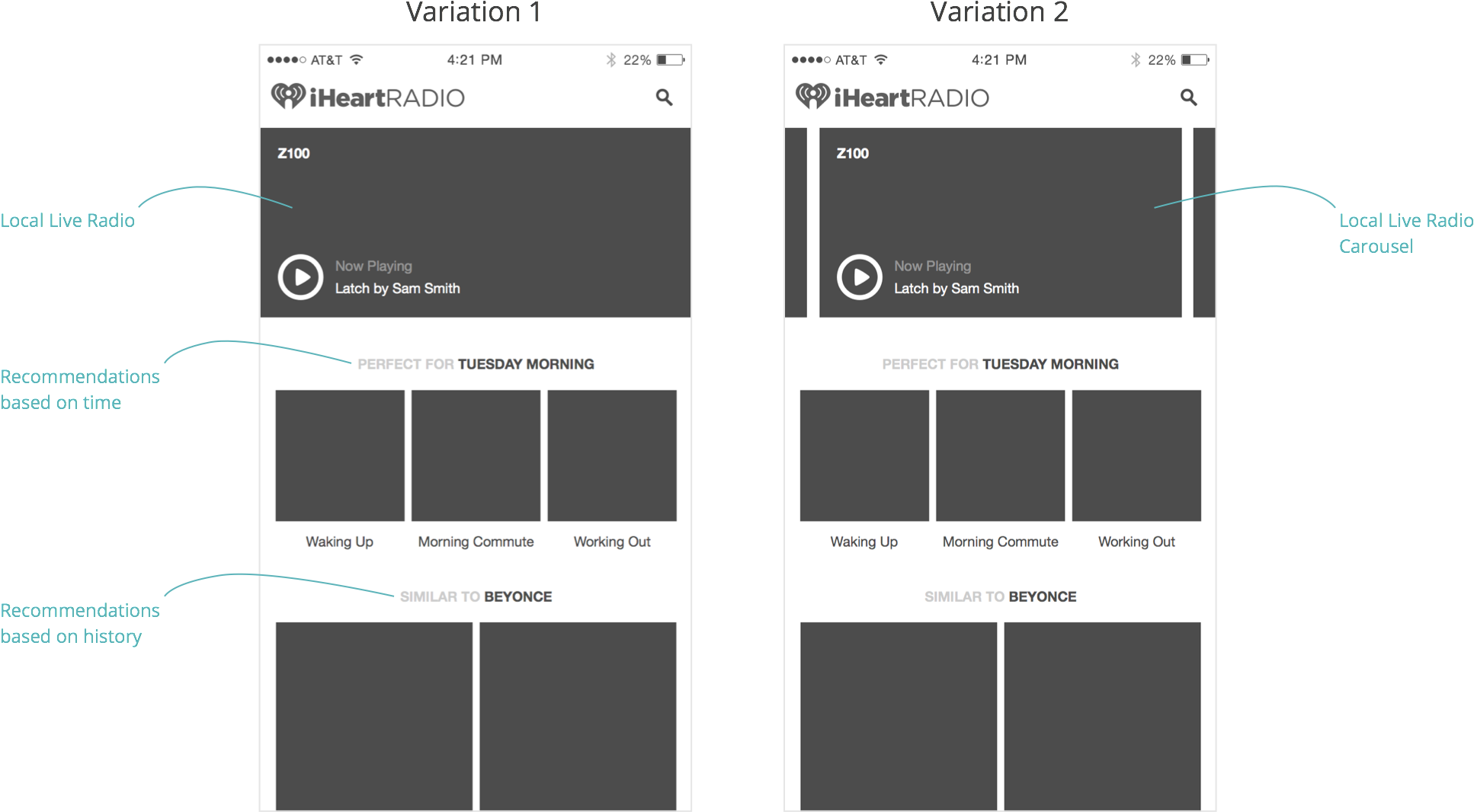
I started by sketching some high level layouts with some of the content priorities in mind. Part of the goal here was to break the “sameness” of the flat list view that exists, and create clear groups of content with some hierarchy to help guide the user's eyes through those groups.
Proposed browse layouts
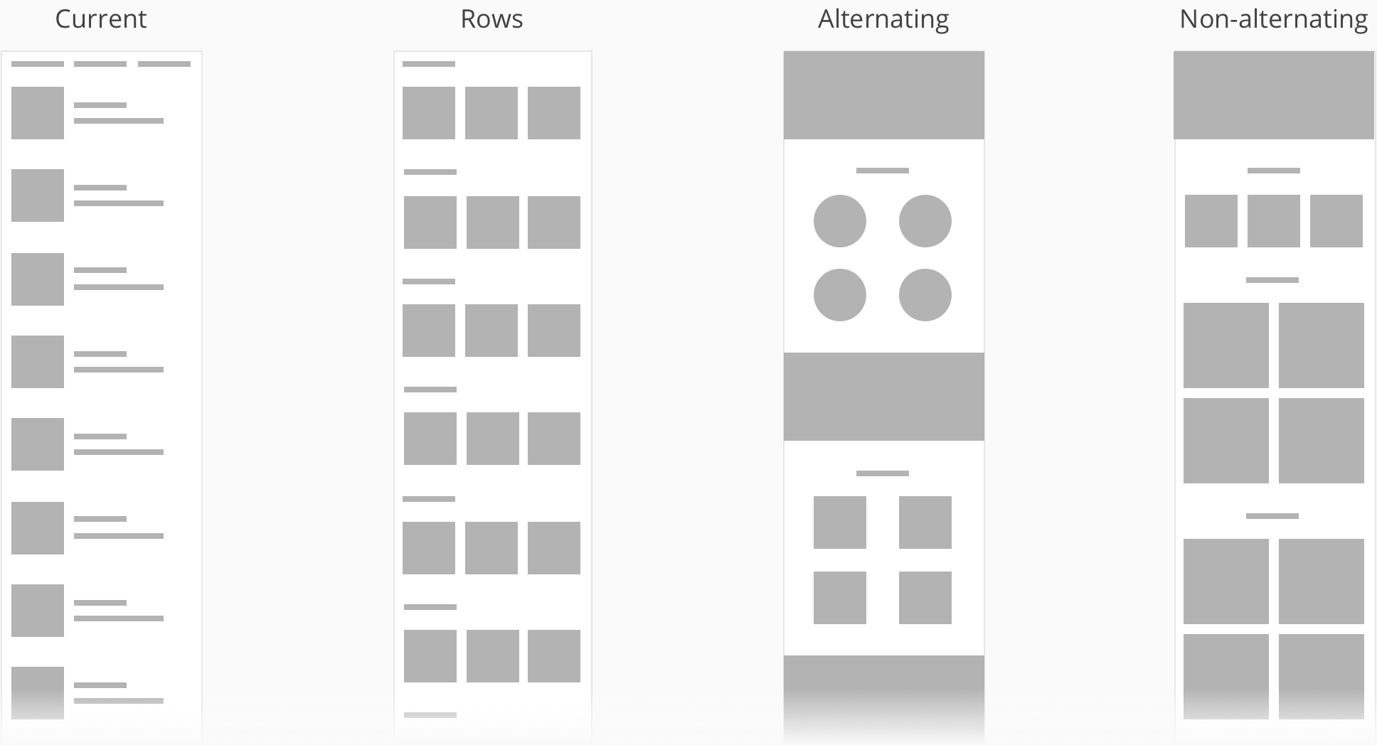
...the goal here was to...create clear groups of content with some hierarchy to help guide the user's eyes through those group
2x2's with hero dividers
Pyramid
Throughout the process, I had quite a few ideas around interactions that I decided to prototype in order to get a real feel for how effective or ineffective each might be. I imported my wireframes from Sketch into Framer Studio, where I could easily manipulate the layers in CoffeeScript. Framer has become my prototyping tool of choice because of how it integrates with Sketch and Photoshop, and, once you're familiar with it, how quick it can be to create some very complex and high-fidelity interactions.
Early prototypes
I took a look at the content that exists in the app today and how content could, not only be better organized, but also how different content types could more effectively be tied to each other.
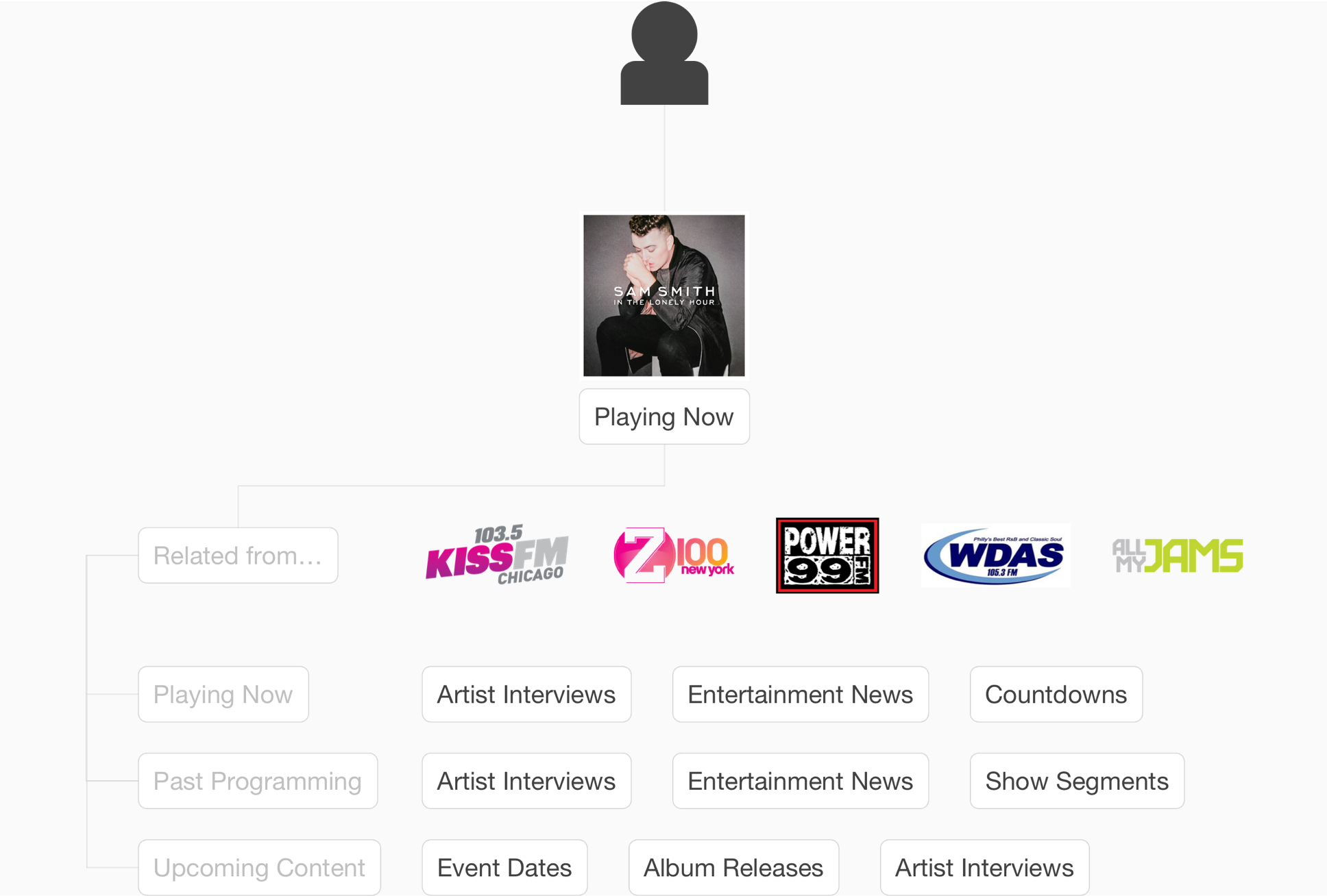
Live radio essentially has 3 main buckets of content: shows already played, what's playing now, and what's coming up. Each bucket of content has a slew of content types including artist interviews, entertainment news, other show segments, and, of course, music.
Live radio content
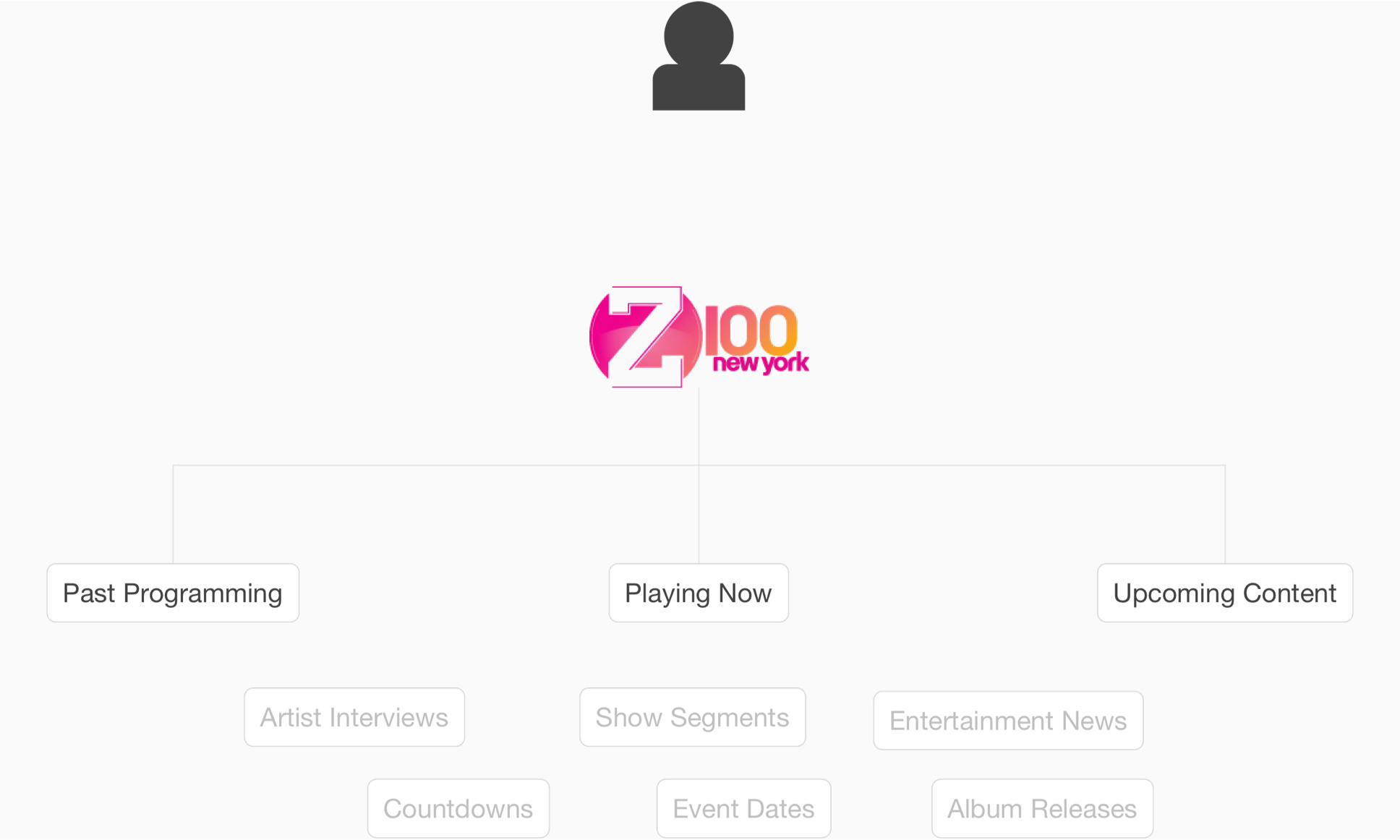
However, in its current state, those buckets of content aren't easily accessible from the live radio station they relate to. A clear and accessible relationship doesn't exist between the live radio station and its past and future content. This is a problem because users don't have clear visibility into all the content that live radio has to offer, things like listening to past artist interviews on demand or seeing that an artist they like will be interviewed in an upcoming show.
How users get to live radio content today
...users don't have clear visibility into all the content that live radio has to offer
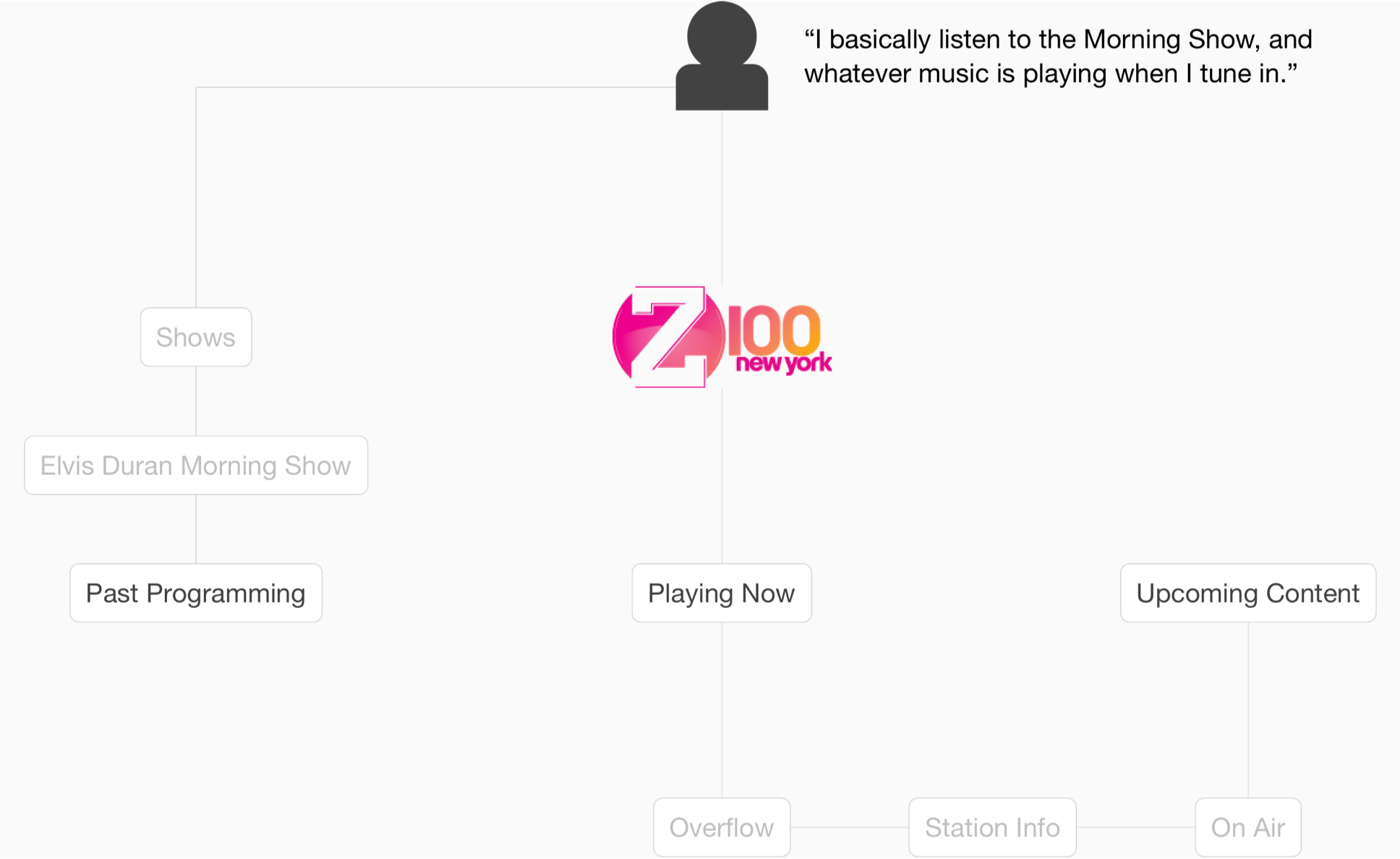
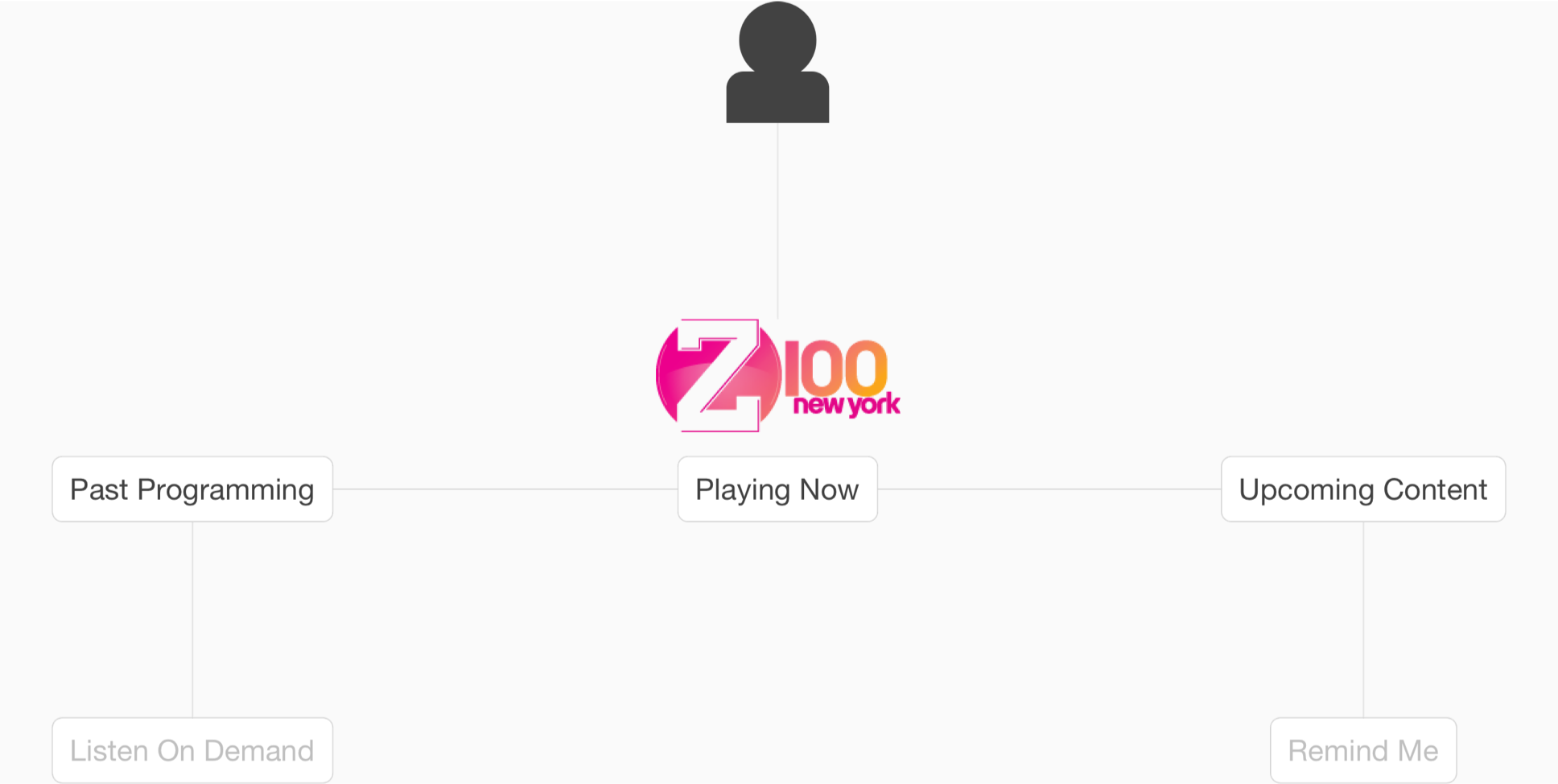
I proposed having content centered around the live radio station they relate to instead of content sitting siloed in their own part of the app based on type.
Proposed organization for live radio content
Likewise for artist radio, any content that relates to that artist, regardless of whether it's music or talk based, should be easily accessible when listening to that artist.
Proposed organization for artist radio content
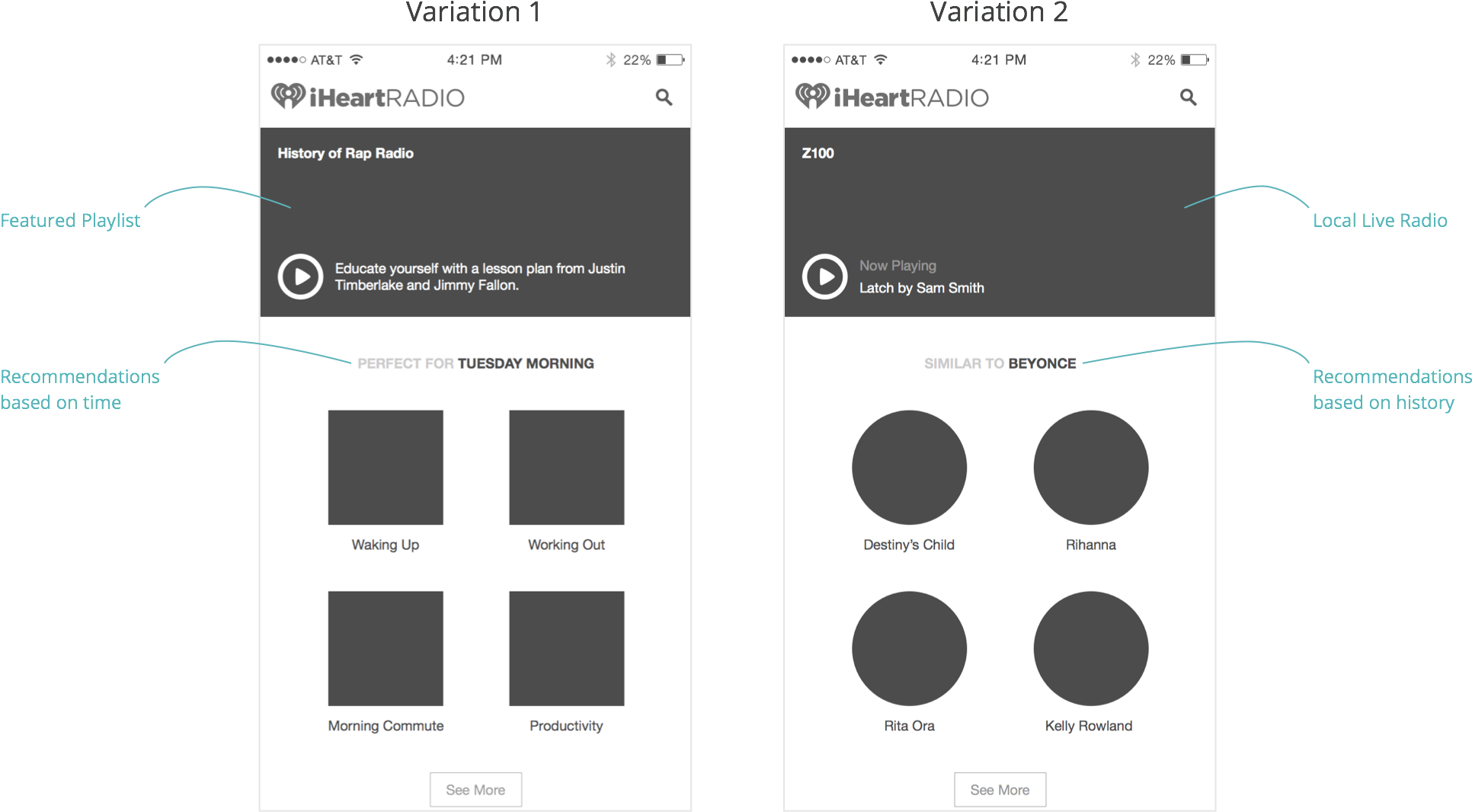
Based on this thinking, I iterated further on the player-centered IA, imagining what it might look like to create more meaningful relationships between content in the app. I eventually settled on the idea of having live radio and artist profiles, and having some mechanism for surfacing related content while you're listening.
Player-centered IA iterations
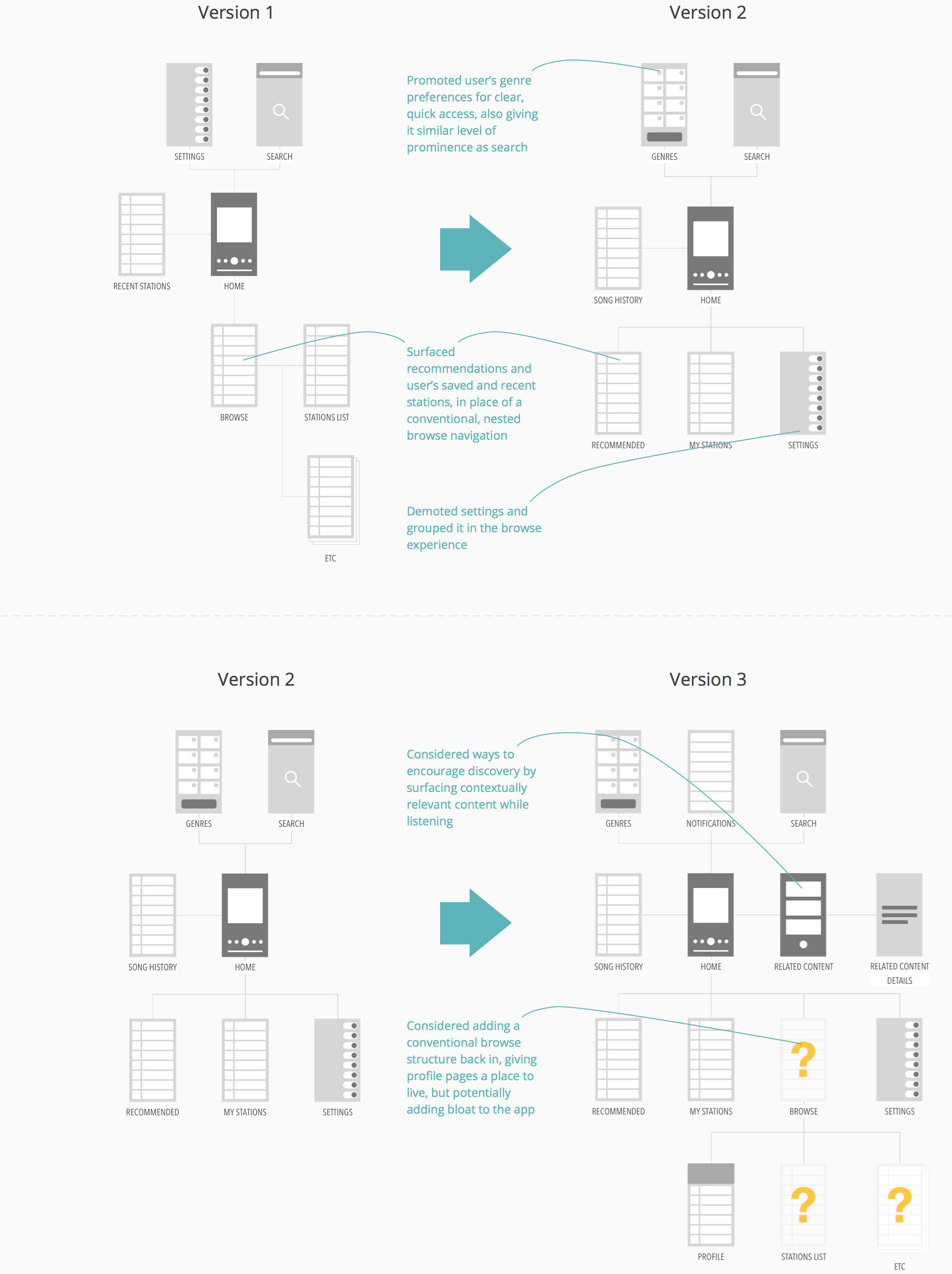
I also took a pass at determining the different instances of profiles and related content screens we might want.
Player-centered IA version 3
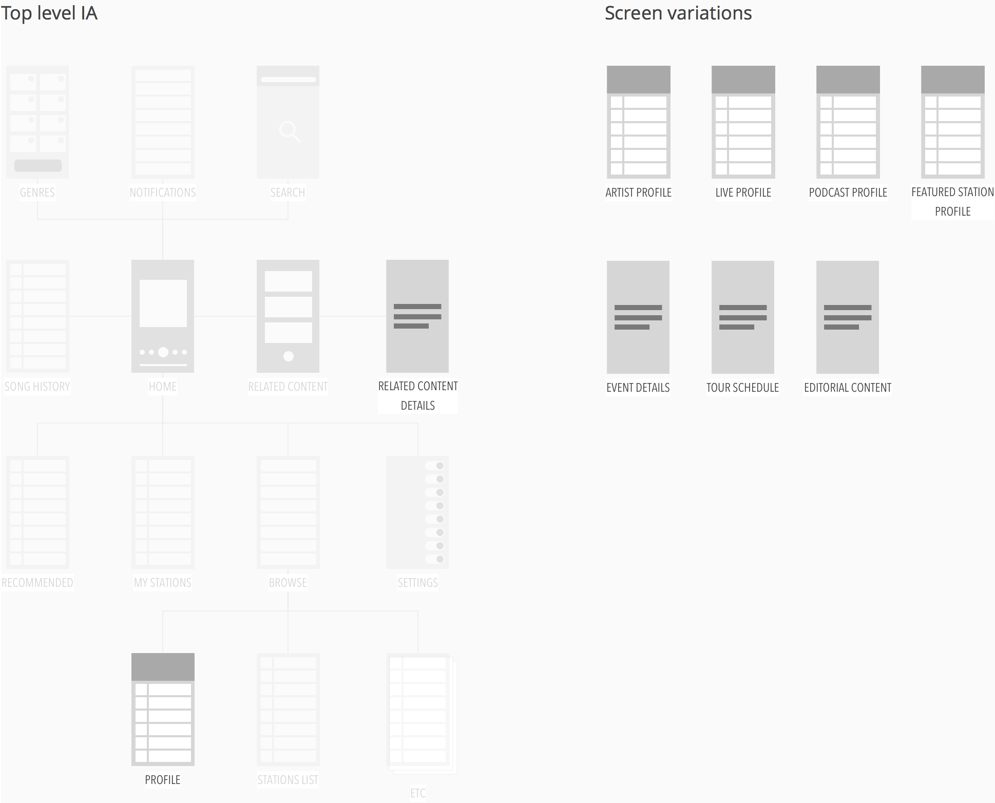
For this first pass, I decided to focus on just live radio and artist profiles and what surfacing related content might look like. Before designing screens, I first listed out all the content that might appear in each and narrowed the list down to just the most valuable pieces of content.
Content for profiles and related content screens
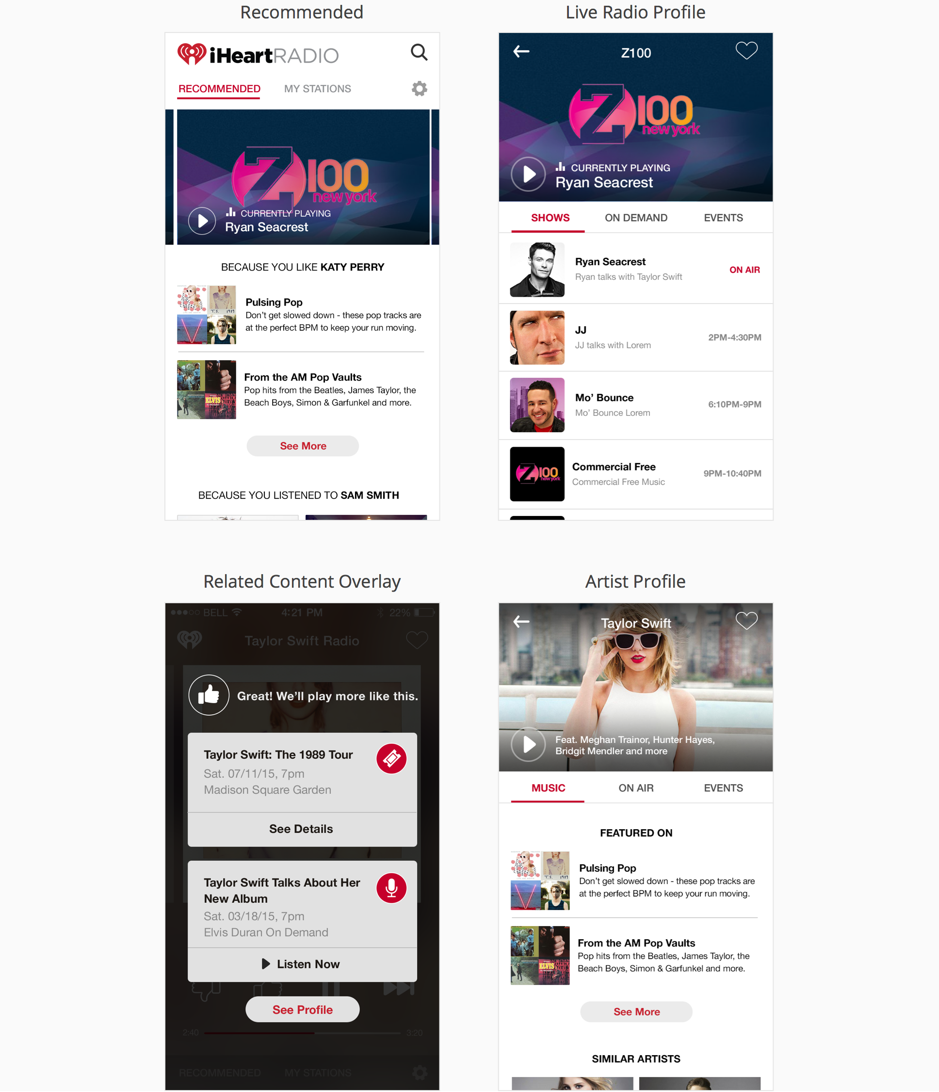
- Live Radio Profile
- What's playing now
- Upcoming show schedule
- Related Podcasts
- Recent Podcast Episodes
- News & Events
- Artist Profile
- “Featured on” playlists
- Similar artists
- “Popular on” live radio stations
- Past radio appearances for on demand listening
- Future radio appearances for setting a reminder
- News & Events
- Related Content Overlay
- Recently released albums or songs
- Recent podcast and radio appearances
- Upcoming events & tour dates
- Entertainment news
Because I was a little short on time to get this out for review, I asked a fellow designer to lend a hand with comps and we split the work.
Comps for player-centered concept
To really bring things home for this concept, I put together another prototype in Framer, importing layers from Photoshop to manipulate and really fine-tuning interactions and animations.
High-fidelity prototype
Conclusion
The redesign was something I was mostly doing on my spare time in the office, maybe a day a week over the course of a few months, while handling my responsibilities on other projects. It was something that myself, the product owner, and the rest of the mobile team were very passionate about. We felt it was important to figure out where the product needs to be so we could figure out how to get there, so we made the time for it. The plan was to try to sell the work through to C-level stakeholders and the larger product team once we'd gotten far enough along in our thinking.
I left iHeartRadio shortly after my work on the high-fidelity prototype. My hope is the work will be leveraged in some meaningful way, whether it's for an actual redesign in the future, or for making decisions on more incremental improvements in the existing app.